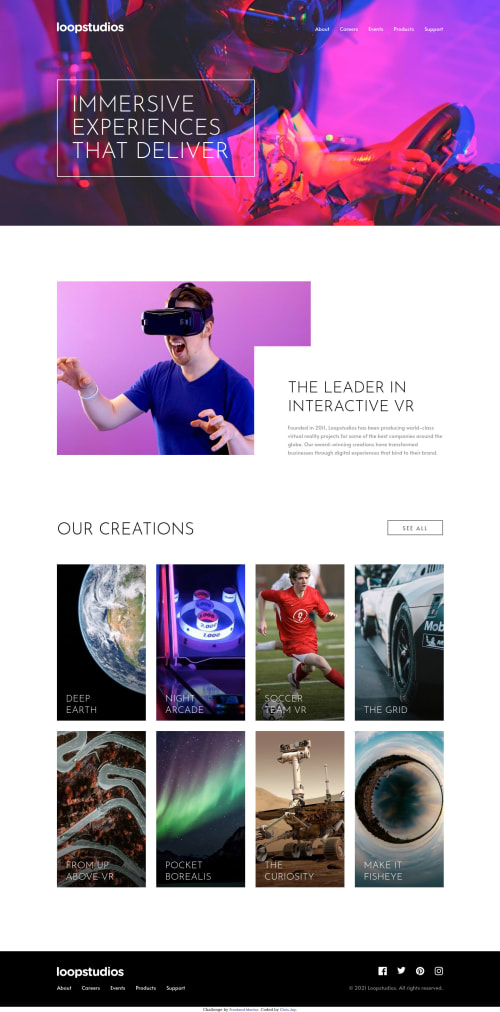
Loopstudios Landingpage using HTML CSS JS

Solution retrospective
First challenge done. Any tips ?
Please log in to post a comment
Log in with GitHubCommunity feedback
- @pikapikamart
Hey, awesome work on this one. Desktop layout looks really great, though you have missed the dark-overlay in the hero-section, adding that would be really great so that the navlinks color will pop out more since it is complementing the white color. Site is responsive, but in some sizes like at 600px, scroll down on the collections and you will see that the
see alllink is overlapping the heading text on its left side. Each of the collection card as well is squished, it would be awesome to create a responsive layout in the collections card so that they won't appear like that. Mobile state looks great though, but you only changed the hero-section image at point 375px which is too small for other phones since lots have higher width than that. Toning the breakpoint up would be great.Some other suggestions on the site would be:
- It would be great to have this markup:
<header />
<main />
<footer />
This way, all content of your page will be inside their own respective landmark element.
- Website-logo-link
atag should have eitheraria-labelattribute orsr-onlytext inside, that describes where the link would take the user. Usually, website-logo directs user to homepage so usehomepageas the value like `aria-label="homepage". - Remember that a website-logo is one of the meaningful images on a site so use proper
altfor it. Use the website's name as the value likealt="loopstudios". - Avoid using
idto target and style an element since it is a bad practice due to css specificity. Instead, just useclassto target element. - The hero-text should be using a
h1since it looks like the primary heading on this layout. Usingh1would be really great. - When making a text uppercase, do not directly type the word in the markup capitalized. Doing this results screen-reader reading the text letter-by-letter and not by word. Instead just use regular lowercase text and just use
text-transform: uppercaseon it on the css. - Also, do not just use
spanto wrap a text, use other meaningful tags on it. - I would use a descriptive
alton the vr-guy though since the text in that section describes the person as well. - The bold text in the vr-guy section should be a heading tag. Use
h2on it. our creationsshould be a heading tag like anh2. Remember that heading tags are important in a site since it gives an information on what each section that they belong contains. For examples, making theour creationsa heading tag, it gives information that the section will contain the website's creation, hence those 8 collections.- For each collection, it would be great to use a
figuretag on this one since those collection title names are thefigcaptionfor each of theimg. - Also, it would be much better if you didn't use the
atag as the container for the whole collection item. It would be much better if you would do something like:
<figure>
  <img src="" alt="">
  <figcaption>
    <a href=""{title in here}></a>
  </figcaption>
</figure>
The figure will be using
position: relativeand theatags pseudo-selector maybe the::beforewill beposition: absoluteand will useheight: 100%andwidth: 100%so that the whole creation item will be clickable and this will be a more valid markup.FOOTER
- Don't use the
navto wrap the whole content.navtag is used for links that are your websites' primary links or navigational links. Because by wrapping the whole content of thefooterbynavthose social media links will be included as well and as you can see, those aren't navigational links, they are external links. Usedivin-place of the currentnavand usenavonly to wrap the 5 links below the footer-logo. - The website-logo-link should be using the approach that I mentioned earlier. Look it up:>
- Each
atag that wraps the social-media icon should have eitheraria-labelattribute orsr-onlytext inside it, defining where the link would take them. For example, you should usefacebookas the value if the link would take the user to facebook. - Social-media image should be hidden since it is only a decorative image so use
alt=""andaria-hidden="true".
FOOTER
- Hamburger menu should be using a
buttonsince it is an interactive component.
SUPPOSING BUTTON IS USED
- The hamburger
buttonshould have a default attribute ofaria-expanded="false"and it will be set totruewhen the users toggles it and vice-versa. - The hamburger
buttonshould have eitheraria-labelattribute orsr-onlytext inside it which defines what thebuttondoes. You could usearia-label="navigation dropdown menu" - The
imginside the hamburger-menu should have been hidden since it is only a decorative image. - Your placement of the hamburger and the dropdown is incorrect. The hamburger should be placed "before" the dropdown so that, after toggling it, the focus will be next to the dropdown. Swap them up or place the toggle before it.
- Lastly, the dropdown is being hidden only visually but still being picked up by screen-reader since you are not hiding it properly. On the hidden state of the dropdown, add a
visibility: hiddenon it and when thebuttonis toggled, use avisibility: visiblityon the dropdown. This way content will be hidden and shown properly if needed.
Aside from those, great job again on this one.
Marked as helpful

Join our Discord community
Join thousands of Frontend Mentor community members taking the challenges, sharing resources, helping each other, and chatting about all things front-end!
Join our Discord