Made in HTML and using SASS for the first time

Solution retrospective
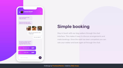
Hello, i used SASS for the first time because I read it's easier but i think it's sooo much harder than simple CSS, i had big troubles to make responsive this challenge, at the end I think it's all good.
All feedback is welcome. Thanks
Please log in to post a comment
Log in with GitHubCommunity feedback
- P@dwhenson
hey @edycerpa great work on this one - it looks lovely! 🙌 I have also only just started SASS, and I have to say after a couple of challenges I'm really starting to love it. But I also found it really tricky to change over from regular CSS.
I would really suggest trying a couple more challenges and see if you get comfortable with it. That said, I really made sure I was OK with the CSS basics, and how I structure my code before trying it - so I wouldn't rush into it.
Some small suggestions on this challenge:
1: It looks great at large viewports, but at smaller screens the margin on the bottom of the phone pushes the text quite a way off screen - you might want to reduce this?
2: I would consider using
background-imagefor the background images rather than thebody-bgdivs you have at the moment. This will just make your code cleaner.3: Semantically this one is tricky, and up for debate for sure, but I would consider putting all the messages in a
oland have them asliitems?4: Lastly, and I think I'm on stronger ground here, I would suggest the
msgarea at the bottom should be aninputwith the submit element as abutton.Really nice job though 👍 Keep up the great work!! Cheers 👋

Join our Discord community
Join thousands of Frontend Mentor community members taking the challenges, sharing resources, helping each other, and chatting about all things front-end!
Join our Discord