Mainly Css flexbox and grid

Solution retrospective
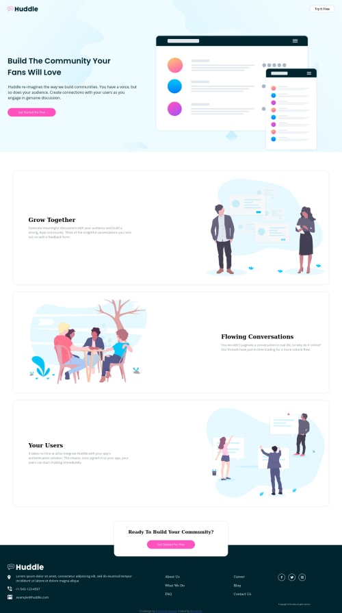
Hi everyone,
I am really keen on how the background for the first section is done to fit perfectly with the layout for the mobile version?
The approach I was putting the background on the div container, which has all the content of header and section-1 inside.
In the end, my solution is close, but not as it should be I tried out a lot of things with - - _Background-position: X Y; _Background-sizes; _Changing the font size, padding of the content;
(I changed of course the SVG for the mobile version)
What else I could try out? Thanks for your help!
Please log in to post a comment
Log in with GitHubCommunity feedback
No feedback yet. Be the first to give feedback on Ben's solution.
Join our Discord community
Join thousands of Frontend Mentor community members taking the challenges, sharing resources, helping each other, and chatting about all things front-end!
Join our Discord