Maker Landing Page

Solution retrospective
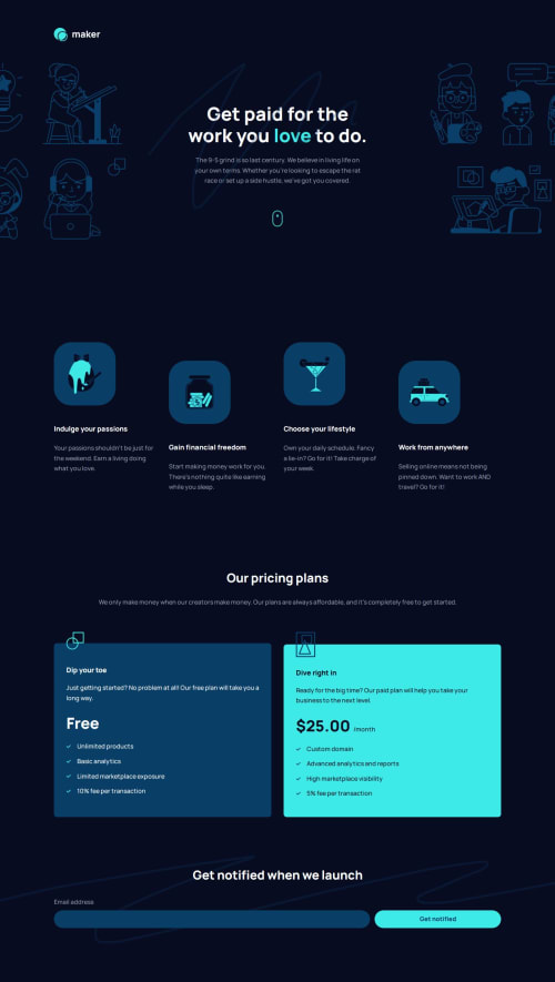
My biggest achievement in this challenge was using Grid and Subgrid for the pricing plan card layouts. I thought about using absolute positioning for the icons on the edge of the cards, but I think Grid is more robust, so I'm pleased with the result. Instead of using padding-inline on the card, I also used Grid and Subgrid to create 3 columns of the card, where columns 1 and 3 are set to the size of what the padding-inline would be, while column 2, where all the content is placed, takes up the remaining space.
I also tried to set up a 3-column grid on the body, again intending to have the content in the middle column, with columns 1 and 3 acting as potential "breakout" columns. However, after some experimentation, I used padding-inline instead.
The icon "boxes" in the middle was harder than I predicted. First I tried to set background-color on the images themselves, but I found out I needed to wrap them in a ````, for the background color and the padding. Since the icons are different widths and heights, I decided to give the icon boxes a fixed width, since they are all the same width and height in Figma. I centered the icons using display: grid and place-content: center.
As usual, I struggled quite a bit with the hero "decoration" - things such as background images, positioning, and transform are still top of my "least favorite things about CSS", haha. With some experimentation, I finally managed to get it right. I also managed to do the cool hover effect in the hero, by changing the stroke, fill and opacity on :hover.
As always, I'm open for any feedback :)
Please log in to post a comment
Log in with GitHubCommunity feedback
No feedback yet. Be the first to give feedback on Øystein Håberg’s solution.
Join our Discord community
Join thousands of Frontend Mentor community members taking the challenges, sharing resources, helping each other, and chatting about all things front-end!
Join our Discord