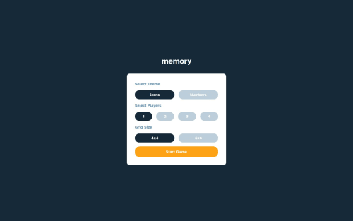
Not Found
Not Found
Not Found
Not Found
Not Found
Not Found
Not Found
Not Found
Not Found
Not Found
Not Found
Not Found
Not Found
Not Found
Not Found
Not Found
Not Found
Not Found
Not Found
Not Found

Submitted

Matching pairs game using React.js and styled-components

#react#styled-components
P
Anna 150

@aproskur

Desktop design screenshot for the Memory game coding challenge

This is a solution for...

  • HTML
  • CSS
  • JS
4advanced
View challenge

Design comparison


SolutionDesign

Solution retrospective


What are you most proud of, and what would you do differently next time?

I used styled components for the first time. Next time I'll minimize the use of unnecessary nested styled components, preferring instead to style simple tags within them. Overall, I liked the flexibility styled components offered for dynamically changing styles.

What challenges did you encounter, and how did you overcome them?

Ensuring responsive design for both small and large screens presented the most significant challenges for me

Community feedback

P

@gsterczewski

Posted

Hey Anna congratulations on completing this challenge 👏.

I noticed a few things you could improve, I'll address a few of them.

  • On the desktop I see an unnecessary horizontal scrollbar. This is because you set overflow:scroll in the page_gameContainer... class. Removing this rule should solve this particular problem.
  • Consider adding height:100% to body and perhaps page_gameContainer to fill 100% of the height on the desktop.
  • You may also want to consider using button instead of div for clickable elements, this will improve accessibility and allow the game to be controlled using the keyboard.

Once again, congratulations on your work. Best of luck!

Marked as helpful

1

P
Anna 150

@aproskur

Posted

@gsterczewski Hi Grzegorz, Thank you very much for taking the time to review my code and offer your feedback. I appreciate your suggestions and have carefully considered each one.

Regarding the observation of an unnecessary horizontal scrollbar, I've double-checked the code and current implementation, specifically with the CSS rules: html, body { overflow-x: hidden;} This setup is intended to prevent any horizontal overflow across the site. As a result, I wasn't able to identify any horizontal scrolling behaviour during my tests, even if I remove this overflow-x rule and max-width: 100vw rule. It's possible that the appearance of a horizontal scroll may vary between different browsers, devices, or even game modes within the application. Could you please specify under which conditions (such as browser type, screen size, or specific game mode) you encountered this horizontal scrollbar? This information would be very helpful. There is a vertical scroll that appears when multiplayer is chosen, but it is caused by the overflow of the container with infoItems, which I will fix later. Anyway I removed an unnecessary overflow: scroll from pageContainer class that you mentioned.

Concerning the suggestion to add height: 100% to the <body> and perhaps to the page_gameContainer, I've considered the implications for the overall design and layout of the game. Given the current structure and behaviour of content within the game, including scenarios where content dynamically adjusts based on game state, setting a fixed height of 100% does not appear to be necessary for achieving the desired layout and functionality. The application is designed to accommodate content that naturally extends vertically, which is effectively managed through existing CSS rules without explicitly setting height: 100%. Anyway I played around adding explicit height to body (and html as well), but didn’t notice any improvements. But thankfully to your comment I figured out what the issue was. Upon revisiting the code in light of your feedback, I realised that an error had occurred during my recent adjustments for smaller screen layouts. Specifically, necessary padding that was crucial for the desktop version of the game had been accidentally removed. This oversight on my part may have contributed to some of the layout issues you highlighted.

Thanks for the nudge on using <button> elements for better accessibility. I've double-checked, and all clickable elements are indeed styled as buttons: const StyledToggleButton = styled.button. And I reuse the same component in the project. I’m on the lookout for any stray <div>s acting as buttons, but so far everything seem to be in line with this standard

Again thank your for your feedback, and congrats on completing this challenge too!

1
P

@gsterczewski

Posted

Hey @aproskur, thank you for taking the time to reply. Maybe your link to live preview is not updated, because I can still see div elements rendered on game board instead of button in devtools, and there are not focusable. Concering the height, indeed the problem is no longer present. Horizontal scroll-bar are gone too.

Have a good day.

0
P
Anna 150

@aproskur

Posted

@gsterczewski I see, do you mean I should implement Card elements as buttons? That makes sense! Sorry the confusion

0
P

@gsterczewski

Posted

@aproskur yes, sorry I wasn't very clear. I was refering to elements that you click on to reveal a number/icon.

0
P
Anna 150

@aproskur

Posted

@gsterczewski no worries, I just hadn't thought of the cards as button elements at all, but I absolutely agree that this will make the game more accessible. I will definitely add this improvement. Thanks Grzegorz :)

0

Please log in to post a comment

Log in with GitHub
Discord logo

Join our Discord community

Join thousands of Frontend Mentor community members taking the challenges, sharing resources, helping each other, and chatting about all things front-end!

Join our Discord