Submitted 3 months agoA solution to the Product preview card component challenge
mayhem in css

@LostProcessor
Solution retrospective
What are you most proud of, and what would you do differently next time?
next time i will be faster
What challenges did you encounter, and how did you overcome them?i did not know how to align content like i should have done inside my button
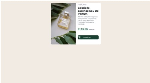
What specific areas of your project would you like help with?have the button to look like the design provided
Code
Please log in to post a comment
Log in with GitHubCommunity feedback
- @chrisk71
The overall design looks good.
You need to center the card on the screen. The button and hover-over colors are switched, should be light green for the button and dark green for the hover effect. To move the icon and text within the button, play with the padding. I used display: inline-flex on the button with gap and padding on my solution.

Join our Discord community
Join thousands of Frontend Mentor community members taking the challenges, sharing resources, helping each other, and chatting about all things front-end!
Join our Discord