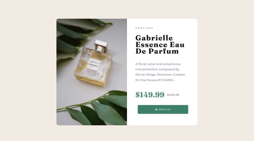
Media queries for responsive design, and css variables.

Solution retrospective
I found it difficult to figure out how to display two images, or how to have both desktop and mobile images in the same html file.
I'm unsure about how I wrote my css in order to position things, feels like I can write much better css, but I learned a lot which was great.
Would like to know where or how to store or how to work with different image sizes when going from desktop to mobile.
Please log in to post a comment
Log in with GitHubCommunity feedback
- @dusan-b
Hello Kevin,
to allow the browser to choose the appropriate image regarding the screen size, you should use the
<picture>element.You could do something like this:
<picture>
  <source srcset="./img/image-mobile.jpg" media="(max-width: 400px)" type="image/jpeg">
  <img src="./img/image-desktop.jpg" alt=" Some alternative text">
</picture>
This way you are saying to the browser to load the smaller image for devices that are up to 400px wide, and otherwise to load the bigger image. You can also add more image versions by adding multiple
<source>elements.MDN has a great article about it, to get started:
<picture>: The Picture element
Hope this helps. Happy coding!
Marked as helpful - @salmaane
Hi Kevin! Good job your project is awesome.
For your question about manipulating images when moving from desktop to mobile or vice-versa, There is many methods but I used to do this one: you have to add the two images (desktop & mobile) to your html code and set the mobile image display property to hidden . and when you move from desktop to mobile by media queries you have to set its display property to block (or inline) and for desktop image set display property to hidden. By this you will be able to change between desktop and mobile images.
I wish this will help you!
Marked as helpful - @suhaybjirde
well done


Join our Discord community
Join thousands of Frontend Mentor community members taking the challenges, sharing resources, helping each other, and chatting about all things front-end!
Join our Discord