Meet Landing Page - Responsive - Mobile First Approach

Solution retrospective
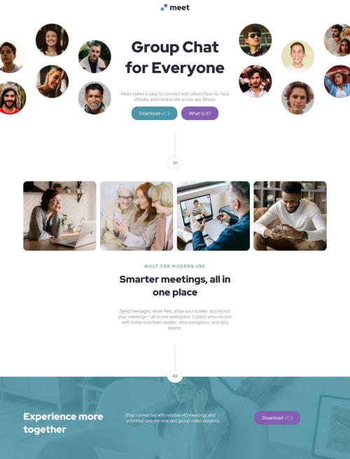
It was very satisfying to implement complex layouts using flex and grid, though it took a lot of time to complete than expected. I learned using a few concepts of SASS and BEM in the project.
What challenges did you encounter, and how did you overcome them?-
Overlaying background with an image and a color, while reducing the opacity of the image was tricky. However it was accomplished by the use of position and other properties.
-
Also overflowing an image inside grid was tricky too. It was accomplished by setting width explicitly to achieve the results.
-
Also, I could not achieve a few things using flex, hence used grid. Eg. giving equal spaces to items on the footer with changing the shape of "Download" button.
-
I would like to know if my styles.scss file code looks clean with css code.
-
I would be open to any other suggestions for improvement.
Please log in to post a comment
Log in with GitHubCommunity feedback
- @MarziaJalili
Bahut bhavy! 👑
✅ A tiny tweak?
For the logo image, wrapping it with the
ulandlielements is not necessary, bhai.You can simply have it nested in the
header>navjust to indicate it's the main navigation of the page and isn't necessary a list item.Other than that, the web's lit!
🔥🔥🔥
Marked as helpful

Join our Discord community
Join thousands of Frontend Mentor community members taking the challenges, sharing resources, helping each other, and chatting about all things front-end!
Join our Discord