
Solution retrospective
The overall execution of this project was better than I expected. Really proud of the progress so far. However, I feel as if I hit a wall when it comes to decreasing the size of the viewport. By this, I mean I work from a 'desktop-first workflow' to a 'mobile-second workflow'. I underestimated mobile design, and now I'm having a hard time trying to decrease the size. This is probably my main priority at the moment, and I will start working with a 'mobile-first workflow'.
What challenges did you encounter, and how did you overcome them?I learned to use the order: 1, with the flexbox CSS rule. This helped bring the .groupchat-info box, which also uses flex-wrap within the .top section, below the images so it can stay positioned below them.
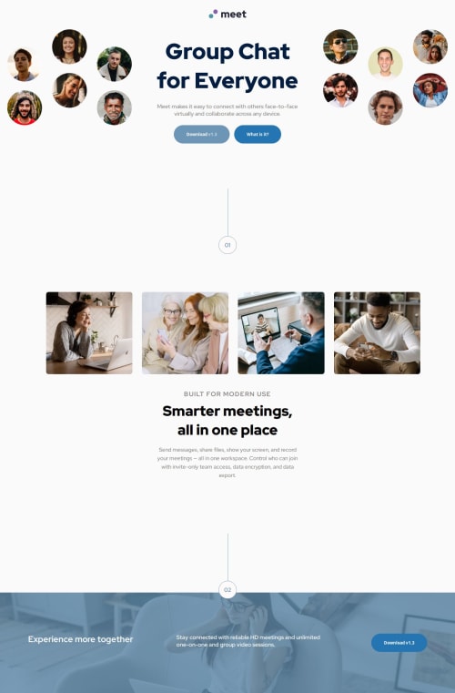
I also learned how to create circles and lines. This was a pretty neat trick that gave me some insight into drawing with CSS.
Lastly, this project tested my patience. There was no tutorial to follow along with this project, so I was left with no real live code to follow along with. However, I want to thank Atif for his solution. His code provided me with examples of where I can use display: grid for my 'image gallery', and his code was what pushed me to figure out the 'order' flexbox rule. Our code is entirely different, but it's incredible how you can have something similar with a different approach.
What specific areas of your project would you like help with?I would appreciate a thorough explanation on how to reduce the size of the overall design. I struggled with the mobile design and couldn't get it to work. My design kept falling apart, and nothing was responsive; it kept going out of place.
Also, when is it appropriate to use % and px? I know % is always good for responsiveness, but I realized that you don't need to change the size of the image itself. The parent container can do that for you, and setting the image at 100% width works well.
Any tips and advice are welcome, as I'm always trying to fine-tune my coding skills.
Happy Coding & Blessings
Please log in to post a comment
Log in with GitHubCommunity feedback
No feedback yet. Be the first to give feedback on Rodrigo's solution.
Join our Discord community
Join thousands of Frontend Mentor community members taking the challenges, sharing resources, helping each other, and chatting about all things front-end!
Join our Discord