
Solution retrospective
It has been a while since I submitted anything here, so this challenge has been a refresher on CSS Grid, and it was a lot of fun despite the end result not being as good as I want it to be.
CSS can become a bit of a nightmare after a few hundred lines. I must have refactored my CSS about five times (my solution was pure flexbox at one point) and it still isn't as perfect as I want. There is probably some redundant CSS left over from my refactors, so I may return to this later and clean it up a bit.
What challenges did you encounter, and how did you overcome them?I'm looking into a BEM and Cube CSS, see if they can help or if should continue finding my own way. I want to get CSS right very early on in my future challenges.
Please log in to post a comment
Log in with GitHubCommunity feedback
- @Gentlestan
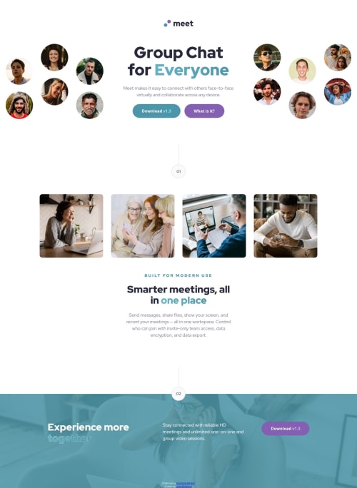
I wish I could upload a screenshot to show you, but I viewed your project on Chrome, and I noticed a couple of things, that I initially commented On desktop, only one centered hero image is being used, and in the footer section, the elements are stacked vertically instead of horizontally as per the design. Also, I spotted that the word "together" in "Experience More Together" has a different color that is not in the original design.
I also checked it on a different browser, Edge, using this website: https://websiteresponsivetest.com/, and the same issue appeared. Please take a moment to check it out, make a few tweaks, and it should be all good. Happy coding!
Marked as helpful - @Gentlestan
First off, I want to commend you on the effort you've put into creating this landing page. The structure is clean, and the design looks polished, especially with the use of well-chosen fonts and imagery. It's clear that you're familiar with flexbox for layout management, and the use of reusable classes shows a good understanding of DRY (Don't Repeat Yourself) principles. Nice job on that!
Suggestions for Improvement:
While the landing page is off to a strong start, there are a few things I'd like to point out for improvement based on my observations:
Hero Section on Desktop:
Issue: The desktop version of the hero section does not display the images on the left and right sides of the hero text as per the design. Instead, the images appear centered. Suggested Fix: Consider using two separate image elements that are displayed side by side, with text in the center, similar to a split layout. You can leverage flexbox or grid to position the images accordingly on larger screens. This will align better with the visual design where the images should be positioned on either side of the hero text.
for example .desktop__hero__section { display: flex; justify-content: space-between; align-items: center; } .desktop__hero__left, .desktop__hero__right { display: block; }
This will allow the images to be displayed on the left and right while keeping the hero text in the center.
Footer Section Layout:
Issue: The footer content (including the "Experience more together" heading, text, and button) is stacked vertically, but the design clearly calls for them to be laid out horizontally (desktop) with justify-content: space-between so that the elements are aligned on the left and right of the section. Suggested Fix: To match the design, you can adjust the flex-direction in the footer’s container. Using flex-direction: row; and justify-content: space-between; will position the elements horizontally, which is what the design intends. This change will ensure that the text and button are properly aligned on opposite ends of the footer.

Join our Discord community
Join thousands of Frontend Mentor community members taking the challenges, sharing resources, helping each other, and chatting about all things front-end!
Join our Discord