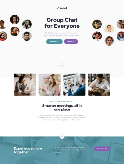
Meet landing page

Solution retrospective
In this task, I tried using Tailwind for the first time. I had to apply quite a few different approaches that were new to me. For example, I started by overriding some default variables to match the design:
@theme {
  --font-sans: "Red Hat Display", sans-serif;

  --color-cyan-300: oklch(0.87 0.0868 215.42);
  --color-cyan-500: oklch(0.76 0.0827 215.89);
  --color-cyan-600: oklch(0.62 0.075853 216.1335);

  --color-white: #fafafa;

  --text-base: 1rem;
  --text-base--line-height: 1.5;
  --text-lg: 1.125rem;
  --text-lg--line-height: 1.1;
}

@layer theme {
  body {
    @apply text-slate-900;
  }
}
Some repeating elements had to be extracted into components. For example:
@layer components {
  .img {
    @apply min-h-36 rounded-lg object-cover md:min-h-40 lg:min-h-64;
  }
}
Initially, I built the page without following a mobile-first approach, which made working with breakpoints inconvenient. So I restructured the layout starting from the mobile design.
What specific areas of your project would you like help with?Overall, I’m satisfied with the new experience of working with this framework, though it’s clear I still need more practice.
Please log in to post a comment
Log in with GitHubCommunity feedback
No feedback yet. Be the first to give feedback on Olexii Bulhakov's solution.
Join our Discord community
Join thousands of Frontend Mentor community members taking the challenges, sharing resources, helping each other, and chatting about all things front-end!
Join our Discord