
Solution retrospective
I'm proud of how I handled a tricky CSS specificity issue and how I responded to critical feedback from the FEM community. At first, I reacted defensively, but after taking a step back, I realized the critique was spot-on and incredibly helpful. I applied what I learned and improved the layout and responsiveness. Next time, I’d focus more on clean and strategic CSS from the start, being intentional with my selectors and layout logic rather than jumping straight into styling.
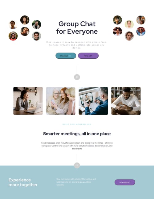
What challenges did you encounter, and how did you overcome them?One major challenge was getting a component (.component-marker2) to shift layout correctly on mobile. Despite being inside the media query, the styles kept getting overridden, which led to a sea of strike-throughs in DevTools. After digging into CSS specificity, I realized I needed a more specific selector, not just a better-placed rule. Learning how specificity works (e.g., (1,0,0,0) scores) helped me debug smarter.
What specific areas of your project would you like help with?I'd love feedback on my media query structure and whether I'm using CSS Grid efficiently, especially in how I defined my columns, and whether I could simplify or refactor. I’d also appreciate any advice on managing layout overlap (z-index, positioning) in a clean, scalable way. And lastly, I’m curious if I’m on the right track with my responsive design strategy or if there’s a smarter approach I haven’t considered yet.
Please log in to post a comment
Log in with GitHubCommunity feedback
No feedback yet. Be the first to give feedback on Anjelica's solution.
Join our Discord community
Join thousands of Frontend Mentor community members taking the challenges, sharing resources, helping each other, and chatting about all things front-end!
Join our Discord