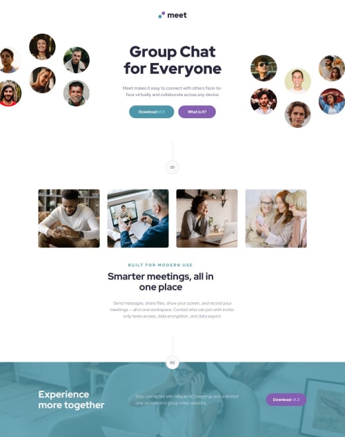
Submitted 11 months agoA solution to the Meet landing page challenge
Meet page with scss and flexbox
sass/scss

@Jaimealicante83
Solution retrospective
What are you most proud of, and what would you do differently next time?
I could adapt the responsive design to mobile, tablet and desktop respecting the measures and positioning difficult elements in the correct position.
What challenges did you encounter, and how did you overcome them?The numbers, I couldn't create the number and the image that surround them with html and css.
What specific areas of your project would you like help with?How to create the numbers and the drawings that surround them with html and css, how could I position the elements in the template easier than the way I did it.
Code
Please log in to post a comment
Log in with GitHubCommunity feedback
- @Basselfathy
Nice work Jaime👏
For the numbers part, this was my solution.
<div class="section-number">
  <div class="line"></div>
  <i class="counter">02</i>
</div>

.section-number {
	display: flex;
	flex-direction: column;
	align-items: center;
}
.section-number .line {
	width: 1px;
	height: 80px;
	background-color: #d1d1df;
}
.section-number .counter {
	width: 56px;
	height: 56px;
	background-color: #fafafa;
	border-radius: 50%;
	border: 1px solid #d1d1df;
	align-content: center;
	font-style: normal;
}

Join our Discord community
Join thousands of Frontend Mentor community members taking the challenges, sharing resources, helping each other, and chatting about all things front-end!
Join our Discord