


@ApplePieGiraffe
Posted
Hi, Dušan! 👋
Nice to see you complete another challenge! 😀 Well done on this one! 👍 Your solution looks pretty good and is responsive! 🙌
A few things I suggest are,
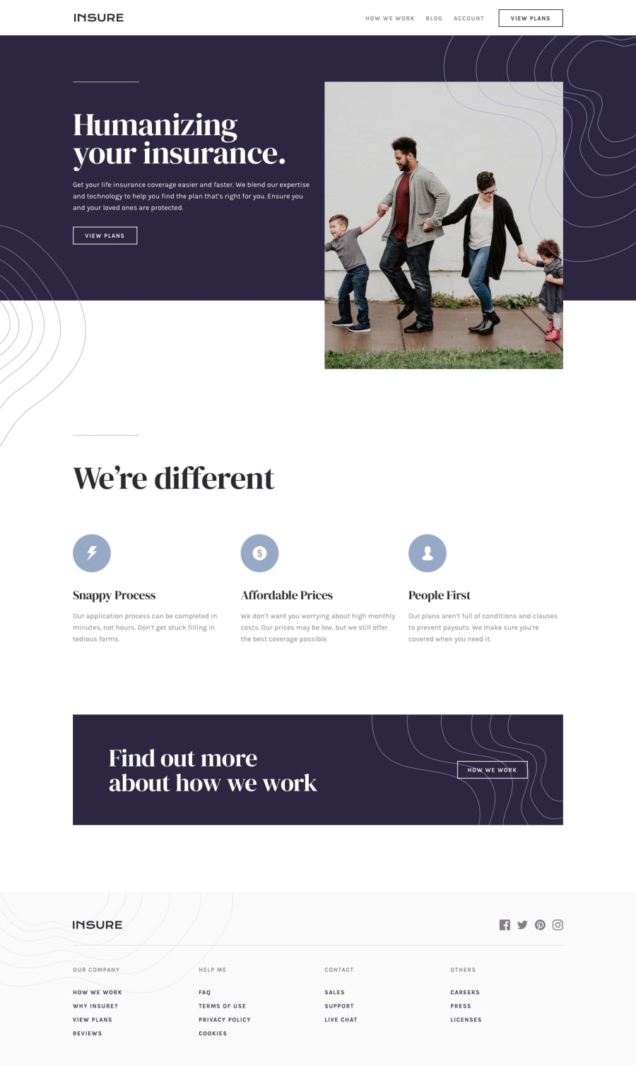
- Only disabling vertical scrolling when the mobile navigation is clicked in the mobile layout (currently, vertical scrolling is also disabled when any of the navigation links are clicked in the desktop layout).
- The hover state of the navigation links of the mobile navigation makes them difficult to see against the dark background of the mobile navigation. I suggest changing them in the mobile-friendly layout to make them easier to see.
Also, I think it's totally fine to build your hamburger menu entirely out of HTML and CSS (and some JS, of course). I actually prefer it since it gives you more flexibility when it comes to making animations and stuff. Just remember to add the correct labels to the menu to make it accessible! 😉
Keep coding (and happy coding, too)! 😁
@DEmanderbag
Posted
Hi @ApplePieGiraffe 👋
Regarding the first message you are absolutely right, I've totally overlooked that fact and this was fixed now.
For the second suggestion, I've used @media (hover: hover) and I didn't expect that someone would use mobile view on a desktop and that issue went unnoticed, this has also been resolved.
Thank you for the suggestion (sorry for the delay with reply :D)
@ApplePieGiraffe
Posted
@DEmanderbag
Haha, no problem! 😀 I just took another look at the updated site, and the changes look great! Good work! 👍
