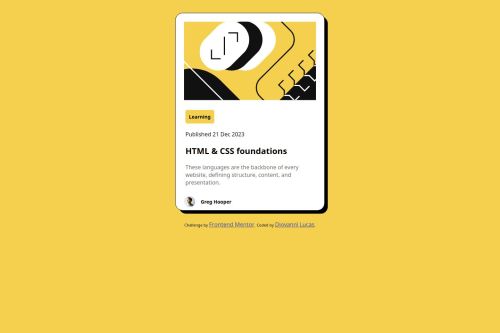
Meu primeiro teste do FrontendMentor, um card responsivo em HTML e CSS

Solution retrospective
fiquei orgulhoso de ter conseguido construir toda a estrutura se problemas, sendo o meu primeiro projeto aqui. Gostei muito do processo de criação e consegui aprender coisas novas.
What challenges did you encounter, and how did you overcome them?tive dificuldades em fazer a responsividade para telas menores, o que me forçou a procurar novas saídas e aprende novos métodos.
Please log in to post a comment
Log in with GitHubCommunity feedback
- P@MikDra1
Here is how you can make your card responsive easily
   .card {
       width: 95%;
       max-width: 42.5rem;
   }
On smaller screens, the card will occupy 90% of its parent (such as the body), but once it reaches 42.5rem (680px), it will remain like that.
I hope this tip was useful to you! 💗💗💗
Great work, and keep it up! 😁😊😉
Marked as helpful - @AdrianoEscarabote
Hi Diovanni-ls, hope you're doing well! I loved how your project turned out, but I’ve got a few suggestions that could be useful:
Using Flexbox or Grid on the
bodyto center elements ensures a more responsive and adaptive layout, fitting different screen sizes seamlessly. It avoids manual calculations and constant adjustments needed withmargin,padding, or absolute positioning. These techniques provide more consistent alignment and simplify the code.flexbox:
body {
    display: flex;
    justify-content: center;
    align-items:  center;
    min-height: 100vh;
}
grid:
body {
    display: grid;
    place-content: center;
    min-height: 100vh;
}
The rest is fantastic.
Hopefully, you'll find it helpful. 👍
Marked as helpful


Join our Discord community
Join thousands of Frontend Mentor community members taking the challenges, sharing resources, helping each other, and chatting about all things front-end!
Join our Discord