Minimal social links profile card using CSS transitions & Flexbox

Solution retrospective
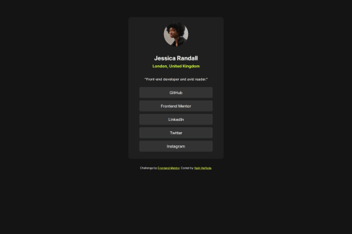
I am proud of how well the layout matches the design specs using only plain HTML and CSS. The button hover effects and spacing fixes — especially between name and location — came out exactly how I envisioned. Next time, I may explore adding a scroll-based animation or experimenting with layered profile backgrounds.
What challenges did you encounter, and how did you overcome them?The toughest part was reducing the gap between the user's name (<h2>) and location (<h4>). It looked visually off due to default margins. I used precise margin-bottom and margin-top controls to fix it and achieved clean vertical balance without disrupting the layout.
What specific areas of your project would you like help with?At the moment, the layout works well across devices. I'm not seeking active feedback on any area, but I’m curious to see how other creators approach subtle transitions and minimalist motion without overloading performance.
Please log in to post a comment
Log in with GitHubCommunity feedback
No feedback yet. Be the first to give feedback on Yash Harfode's solution.
Join our Discord community
Join thousands of Frontend Mentor community members taking the challenges, sharing resources, helping each other, and chatting about all things front-end!
Join our Discord