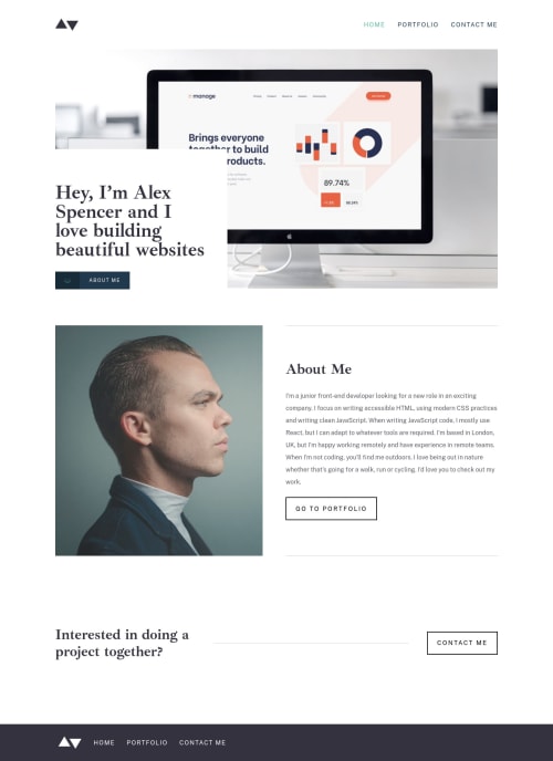
Minimalist Portfolio w/ Vue Router

Solution retrospective
This was a tough one!! 😄
Tricky parts were getting the borders working at different page widths, and getting the Vue CLI to properly access the correct images in the public directory for the portfolio/inner pages. As the project pages are the same page with data and images populated with a query, I was trying to autogenerate the img urls with a method. This worked locally but caused havoc when deployed into production 😫
In the end I put the image paths in the JSON file alongside the rest of the info on the page and it worked fine.
This project was good to get the hang of more complex routing. As ever, any way I could have improved on this v much appreciated 👍😎
says there's an accessibility issue on one of the buttons, but ive got it aria-labelled with a title how the documentation says it should be so should be fine 🤷♂️
Please log in to post a comment
Log in with GitHubCommunity feedback
- @pikapikamart
Hey, awesome work on this one. Just viewed the different links and everything looks great. Desktop layout looks great, there is just a horizontal scrollbar at the bottom, (suspecting a
width: 100vwusage in here), the site is responsive as well and the mobile state looks really great.Don't know if I could check other links as well but here are some: HOME
- On your
footerremove thewidth: 100vwsince this will create the horizontal scrollbar.100vwdoesn't respect the size of the vertical scrollbar on the right side. You can think of it by:
100vw === 100% of the screen
vertical scrollbar on the right side === 16px ish?
So 100vw plus the scrollbar size exceeds the total width of the screen, creating extra space for horizontal scroll.
- I don't know if
aria-currentis needed on the website-logo link since there is thehomelink already. User will get 2 announcement if they are on the homepage when traversing both link. - Website-logo-link
atag should have eitheraria-labelattribute orsr-onlytext inside, that describes where the link would take the user. Since this takes user to homepage, use homepage as the text-value. - For the website-logo
img, I don't know a suitable text for this one though when it comes to portfolio with logo :> but still,logoword as well is not suitable for describing image since this will just announce " logo graphic" and it will be ambiguous for the user. Maybe more valid text. - Usage of
idin styling is not advisable, though I only found it on your hamburger toggle. - For the
headernavbar, usearia-label="primary"on this and on thefooterusearia-label="footer", use it on thenavtag. - The 3 navlinks could have been wrapped inside a
ulsince they are "list" of links. - For the hero-section
about meyou should've not usedbuttonwithatag since this will just create extra navigation when using keyboard. Use onlyatag in here with the arrow-icon on the left side as a::beforeor::afterof theatag. - Also, you don't use
aria-labelattribute onimgtag, you use them for interactive elements likebutton,atag and other that does need a text inside them to give meaning on the element. - Changing
sectiontags into just usingdivon this sincesectionby itself is not informative when navigated as landmark unless they are labelled byaria-labelledbypointing to like a heading tag inside thesection. go to portfolioshould be using anatag since it is a link. When a component directs user to a new page, always useatag becausebuttonare for controls.contact meshould be using a link as well since it directs user.- When using client-side-navigation, always make sure that the next focus after the user navigates to the new page will be on the top of that current page. For example, you using keyboard and go the
portfolioon thefootertag then select it as well using keyboard. It navigates the user properly, but, try using thetabkey again, the focus goes to the next link after theportfoliowhich is thecontact me.
So a good approach would be use something like, when the user navigates on the next page, make the
bodytag have liketabindex="-1"for a moment then transfer thefocuson thebodytag so that the focus after toggling the footer-links won't stay at the bottom. Maybe creating a function that will run on first load for every link, the function will make sure that the focus is on thebodytag of the current-link. Then maybe after like a second, remove thetabindex, asetTimeoutwould be great.FOOTER
- Use
<nav aria-label="footer">.../<nav>so that it will be unique.
PORTFOLIO
- It would be better to use
h2on theManageproject title and use a sr-onlyh1inside themaintag. You could use something like:
<main>
  <h1 class="sr-only"> Alex Spencer Projects </h1>
  .....
</main>
This way it will suit more.
View Projectshould be link as well since they directs user in another page.- Adding a more visual on the
:focus-visiblestate of eachview project. Right now, if you navigate on them using keyboard, it is hard to see where you are at. - Also for me, I would something like screen-reader
spanbetween the "view" and "project" text because for example, using screen-reader and navigating different links, I would just getview projectmultiple times since all links have the same name. I would use something like:
<a href="/projects?project=manage">
 View
  <span class="sr-only"> Manage </span>
Project
</a>
This way, I would know what project am I going into without checking the heading tags at first if just skimming.
CONTACT ME
- On each
input, it would be better to use theforattribute of thelabelto point with their respectiveinputso that thelabeltext could be clicked as well in order to type in the input-field instead of usingaria-labelledby. - Also, you don't use
aria-livefor each of theinputtags. Use only a singlearia-livemaybe aptag inside theformwhich will handle all different event that will occur. For example, the name and email field are incorrect, you will just change the single-aria-live-text to like:
<p aria-live="polite"> Name field incorrect! Email field incorrect!- When submitting a wrong form, you use the
aria-invalidon thelabeltag which should be on theinputtag. Also, a proper way of linking the error-messages would look like:
if ( input is wrong )
  input.setAttribute("aria-invalid", "true");
  input.setAttribute("aria-describedBy", id of the error-message);
else
  input.removeAttribute("aria-invalid");
  input.removeAttribute("aria-describedBy");
The error-message element should have an
idattribute which is referenced by thearia-describedByattribute on theinputelement. By doing that, your user will know that the input is wrong because ofaria-invalidand they will know what kind of error they made because of thearia-describedBy.- Submitting a correct form, it would be great to have something like a success message and you can change the
aria-liveelement to announce something likeform successfully submittedso that the user will be informed right away.
MOBILE
- Use
aria-expandedattribute on thebuttonto inform a user that it has expanded/shown something. - Use
position: fixedon thenavwhen activating the toggle so that it won't create short horizontal scroll. Try toggling the hamburger at the moment and you can see that it creates a scroll at the bottom.
For now, those only. Again, really nice work on this one.
Marked as helpful - On your

Join our Discord community
Join thousands of Frontend Mentor community members taking the challenges, sharing resources, helping each other, and chatting about all things front-end!
Join our Discord