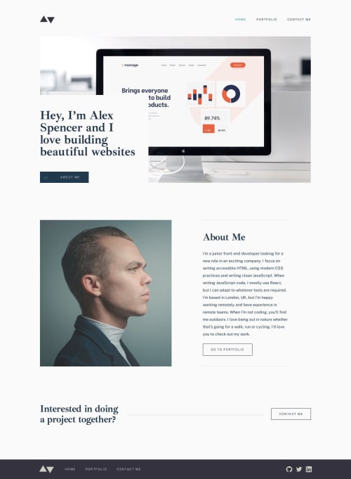
Minimalist portfolio website using React + Tailwind

Solution retrospective
I'm most proud of completing the challenge. Halfway through I noticed I had messed up by overeagerly extracting components, but later they seemed to behave differently on different screen sizes. Lessons learned I guess. Grinding through, taking baby steps day after day is quite the challenge. Don't lose focus of your goals.
What challenges did you encounter, and how did you overcome them?I started 'mobile-first' by creating the different pages for the mobile screen size. That went smoothly. It falsely gave me the impression that I had almost finished. Then I discovered that some layouts were quite different for tablet and desktop. Reusing components for the portfolio detail pages and the rest was not a great success. Changing every reusable component resulted in the entire design shifting in places I didn't want it to. I overcame this problem by taking a step back and by creating less specific reusable components, and a big lesson learned is to not include the margins in a reusable component. It's an advantage to be able to control that outside of the component.
What specific areas of your project would you like help with?I would like help with the project detail pages. The article text all of a sudden moves from one side of the section to the other, but the title and tags remain. I had to use hidden elements for it to work, but I'm curious to discover how others solved that...
Please log in to post a comment
Log in with GitHubCommunity feedback
No feedback yet. Be the first to give feedback on Simon's solution.
Join our Discord community
Join thousands of Frontend Mentor community members taking the challenges, sharing resources, helping each other, and chatting about all things front-end!
Join our Discord