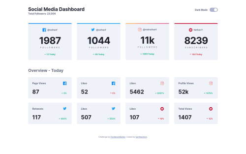
Submitted over 4 years agoA solution to the Social media dashboard with theme switcher challenge
Mob first Social Media Dashboard

@tomthestrom
Solution retrospective
What do you think about absolutely positioning within the elements in the <section class="today">? Should have done it w flexbox?
Regarding BEM, it would have been more ideal to use a shared class between the cards in the general overview and the cards for today.
Anyway, first challenge completed.
Code
Loading...
Please log in to post a comment
Log in with GitHubCommunity feedback
No feedback yet. Be the first to give feedback on tomthestrom's solution.
Join our Discord community
Join thousands of Frontend Mentor community members taking the challenges, sharing resources, helping each other, and chatting about all things front-end!
Join our Discord