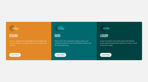
Mobile & Desktop 3 Column Preview using HTML & CSS

Solution retrospective
I had a lot of trouble going from mobile to desktop with this project. I still notice a discrepancy with my grid items when I slowly expand my screen. The items are different sizes before expanding to their max-width. Is there a way to fix this ? I used display: grid for desktop because when I was using flexbox, only the Sedan section was larger than the others and I couldn't figure out why. If anyone could take a look at my code and offer suggestions, I would really appreciate it. This was a hard project for me. Thank you!
Please log in to post a comment
Log in with GitHubCommunity feedback
- @12Kentos
Hey @BeetleJeuse,
Nice job on completing the challenge, it looks good! So I figured out what is causing the issue. If you inspect your page, on the main container you have the following property.
align-items: center;as you shrink the page down if you notice the<p>elements in the SUVS and the Luxury sections grow to have a fourth line before the Sedan section does. Because of this, their container box is slightly larger than the Sedan one. Since the main-container is aligning them to the center, and the Sedan section is now slightly smaller than the other two cards it gets aligned to the center. I hope that made sense? Haha if not let me know, and I'll see if there is another way I can explain it.Keep up the good work!
Marked as helpful

Join our Discord community
Join thousands of Frontend Mentor community members taking the challenges, sharing resources, helping each other, and chatting about all things front-end!
Join our Discord