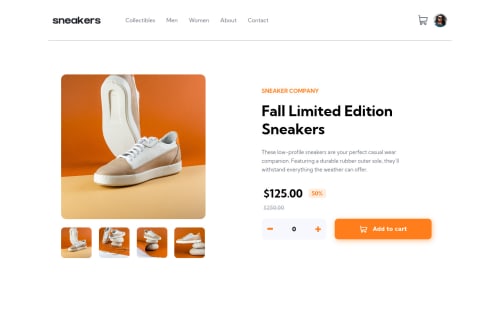
Submitted about 4 years agoA solution to the E-commerce product page challenge
Mobile First Approach (FLEXBOX + MEDIA QUERY+ Responsive Dimensions)

@imparassharma
Solution retrospective
The only issue I am facing is there is a little stuttering in desktop design when I hover on the small images of the product. The div next to it tries to adjust its height(increasing height which is causing stuttering). I first thought it maybe issue because of flex but not able to properly find out the main reason. So if anyone can help with this!
Code
Loading...
Please log in to post a comment
Log in with GitHubCommunity feedback
No feedback yet. Be the first to give feedback on Paras Sharma's solution.
Join our Discord community
Join thousands of Frontend Mentor community members taking the challenges, sharing resources, helping each other, and chatting about all things front-end!
Join our Discord