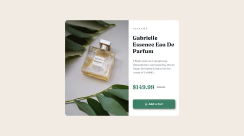
Mobile first design product preview card

Solution retrospective
Hi again! Creating this product preview card based on mobile view first was interesting.
I was wondering if there was anything I could've done in terms of:
- accessibility
- semantic html
- class naming
- how I structure & apply properties to different elements in css
Any feedback would be appreciated :)
Please log in to post a comment
Log in with GitHubCommunity feedback
- @DavidMorgade
Hello Ken! congrats on finishing the challenge, you did a pretty good job with the html and also the CSS let me try to answer your questions!
-
This little project doesn't have that much to add as accesibility, maybe adding a more descriptive text to your alt tag like "Perfume product", you don't have to say it's an image, the screen reader already knows that is an image thanks to your
<img> -
Pretty good in my opinion, would probably change your
<img>with a picture tag, wich will do the job even better, and also will make your code more readable. -
I'm not a fan of dash notation but it looks good the way you did it, your should give it a try to the BEM naming convention, you will never run out of classes and your classes will even make more sense!
-
Try to avoid those pixels, they will badly scale into some screens, stick to relative units like you used in some places (
emsandrems) are your best friends here, pixels should just be used for limited cases. Good job using CSS custom properties.
As a change for your challenge, I would increase the breakpoing of the image, it changes too early from mobile to desktop.
Hope my feedback helps you, if you have any questions, don't hesitate to ask!
Marked as helpful -
Join our Discord community
Join thousands of Frontend Mentor community members taking the challenges, sharing resources, helping each other, and chatting about all things front-end!
Join our Discord