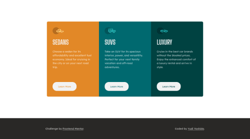
Submitted over 3 years agoA solution to the 3-column preview card component challenge
Mobile first design using flexbox and scss

@yudiyoshida
Solution retrospective
I'll appreciate any feedback. Thank you.
Code
Couldn’t fetch repository
Please log in to post a comment
Log in with GitHubCommunity feedback
- @pikapikamart
Hey, awesome work on this one. Desktop layout looks nice and great to have that custom attribution below it! Mobile state looks fine, but your breakpoint is too early to show the mobile state. Right now, 1024px already shows the mobile state and it is too big for it, desktop layout could use more of those screen don't you think.
Some other suggestions would be:
- There is an error in the console, you might want to check that one out.
- You don't really need to use
articlefor each of the car since they are just normal contents of the site. Usingdivwould be better on this one. - Those car icons are only decorative images. Decorative images should be hidden for screen-reader at all times by using
alt=""andaria-hidden="true"to theimgtag or onlyaria-hidden="true"if the image is usingsvg. - Only use descriptive
alton images that are meaningful and adds content to the site otherwise hide the image for screen-reader users. - Only have a single
h1on a site. It would be great to change those headings into something likeh2. - Since there are no visible text that are suitable to be
h1, theh1would be a screen-reader only heading. Meaning it will be hidden visually but present for screen-reader users. On this, theh1would have likesr-onlyclass and the text-content should describe what is the main-content is all about. Theh1could be placed as the first text inside themain.Have a look at Grace's solution on this challenge inspect the layout and see the usage ofh1as well the stylings applied to it. - It would be better to use
atag rather thanbuttonfor thelearn more, because on a real site, that would be a page-link where the user can "learn" more about a specific car. - Lastly, just for the breakpoint to be adjusted :>
Aside from those, great job again on this one.
Marked as helpful

Join our Discord community
Join thousands of Frontend Mentor community members taking the challenges, sharing resources, helping each other, and chatting about all things front-end!
Join our Discord