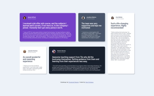
Submitted over 4 years agoA solution to the Testimonials grid section challenge
Mobile first Design with Sass and ES6

@norman02
Solution retrospective
Feedback welcomed!
Code
Please log in to post a comment
Log in with GitHubCommunity feedback
- @ApplePieGiraffe
Hey, John Norman! 👋
Good work on this challenge! Your solution looks pretty good and the grid responds rather well. 👍
A tip or two I might suggest,
- The grid seems to be a little off-center at certain screen widths below 1600px. I suggest adding
min-height: 100vhto thebodyand then using flexbox to center the grid in the viewport (since I often find it easier and more foolproof than other methods). - There's also quite a bit of margin around the grid at over 1600px. You won't need that margin anymore if you use flexbox to center the grid and it'll make your solution a little tighter and without too much extra space, I think. 😉
Keep coding (and happy coding, too)! 😁
- The grid seems to be a little off-center at certain screen widths below 1600px. I suggest adding
- @norman02
Thank you for the suggestion!

Join our Discord community
Join thousands of Frontend Mentor community members taking the challenges, sharing resources, helping each other, and chatting about all things front-end!
Join our Discord