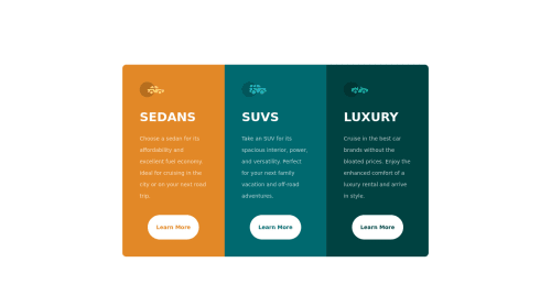
Submitted about 4 years agoA solution to the 3-column preview card component challenge
Mobile first, Flexbox

@Felipe-RL
Solution retrospective
Any advice is welcome, ty.
Code
Please log in to post a comment
Log in with GitHubCommunity feedback
- @AbePlays
Hey Felipe, Great job on the solution. Couple of areas where you can improve upon:
-
The layout falls apart when moving from mobile to tablet size screens. Try making the project responsive for tablet screens too.
-
The buttons does not have hover effects on them. You can simply add a pseudo selector(:active) to add hover effects on your buttons.
Let me know if you need any more help. Cheers!
-

Join our Discord community
Join thousands of Frontend Mentor community members taking the challenges, sharing resources, helping each other, and chatting about all things front-end!
Join our Discord