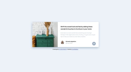
mobile first- flexbox - JS

Solution retrospective
your comments please XD
Please log in to post a comment
Log in with GitHubCommunity feedback
- @YusufWebDev
thanks for the feedback. im not sure what you mean with it being broken on mobile.
- @grace-snow
Hi,
Why have you used overflow hidden on this? I think that's what's causing this to be broken on mobile, both orientations (ill pop images in slack for you)
Html looks good apart from the share link not being labelled.
I recommend you look up how to write good alt text on images too.
Best wishes to you
Join our Discord community
Join thousands of Frontend Mentor community members taking the challenges, sharing resources, helping each other, and chatting about all things front-end!
Join our Discord