Not Found
Not Found
Not Found
Not Found
Not Found
Not Found
Not Found
Not Found
Not Found
Not Found
Not Found
Not Found
Not Found
Not Found
Not Found
Not Found
Not Found
Not Found
Not Found
Not Found

Submitted

Mobile First Four Card Feature Section Using HTML and CSS(Flexbox)

@didyouseekyng

Desktop design screenshot for the Four card feature section coding challenge

This is a solution for...

  • HTML
  • CSS
1newbie
View challenge

Design comparison


SolutionDesign

Solution retrospective


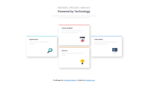
This challenge was very useful for me in terms of building my confidence when laying out elements. Please I would like to know if I picked the best approach to aligning the cards and make them re-align down to mobile screen size. Your feedback is very important for my growth. That being said, if you could take a minute to review my work, I would really appreciate it. Thanks so much for your time.

Community feedback

@didyouseekyng

Posted

@grace-snow I would really love a review from you, I love how you mentor people. please do me this favour

0

P
Grace 27,710

@grace-snow

Posted

Hi @didyouseekyng

Sure, here are some pointers for you

  • you can only have one h1 per page. I would probably take the two you have and combine them into one (with spans wrapping each part for styling)
  • the image tags shouldn't be in figure elements
  • how you've done this with flexbox is fine, but it would be better to use css grid if possible. This is a perfect challenge for it.
  • change the base font size on the body not html element
  • you don't need a min-width of 375px on those cards. Even max-width of that might not be necessary. I would give them one max-width value thats relevant for all screen sizes (no min width) or just control their size with css grid if using that
  • personally I find some of your class names really difficult to understand. Mainly ones like first child second child etc. Those are confusing names because of the pseudo properties in css I think. Nth child means a direct child... So I recommend changing those
  • does font weight 280 exist? Same with 290. I don't think those are right.
  • try not to use pixels for font sizes. Use rems instead. I'd also use rems for min/max widths too, not ems. Do you understand the difference between these?

I hope this is helpful ☺

Marked as helpful

1

@didyouseekyng

Posted

@grace-snow Thanks so much Grace, I'm not sure I would've spotted these bad habits all by myself, I would really love to keep in touch with you, and about my class names, I know I really have to work on that 😂😂 I really struggle with naming classes, so do you think I'd have to learn the BEM naming methodology? Believe me I actually tried using grid with the cards but It was quite challenging so I opted for Flexbox instead, guess I'll have to try it again using Grid, I love me a challenge. Honestly I'm still struggling with the CSS relative units I should practice using in my code, now that you've mentioned it, I'll definitely work on all these pointers, I really appreciate the time you've spent analysing my code, If only I could be your apprentice I wouldn't mind 😄

0

Please log in to post a comment

Log in with GitHub
Discord logo

Join our Discord community

Join thousands of Frontend Mentor community members taking the challenges, sharing resources, helping each other, and chatting about all things front-end!

Join our Discord