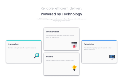
Submitted over 4 years agoA solution to the Four card feature section challenge
Mobile first . HTML / CSS only.

@ramonrp
Solution retrospective
Here we go with my second project! I did mobile first, to take advantage of block elements. I used flexbox inside each section (Karma, Team builder...) to have more about position of pictures. Probably there are better ways to achieve same.
Regarding desktop version, I divided in two sections (header / panel-section). I used grid in the panel-section div.
I have the feeling that my CSS is a little messy...
any feedback is more than welcome
Thanks!!
Code
Please log in to post a comment
Log in with GitHubCommunity feedback
- @liampc
Hello, nice work with this!
- I just noticed that you used another div for the pictures in the box, I think using img tag is sufficient.
- the grid is good but you can also use 'grid-template-areas' and assign 'grid-area' for each of the children, I think it is neater.
- for the 'grid-template-columns/rows' you can also use 'repeat(3, 1fr)'
Have a good day!

Join our Discord community
Join thousands of Frontend Mentor community members taking the challenges, sharing resources, helping each other, and chatting about all things front-end!
Join our Discord