Submitted over 3 years agoA solution to the Job listings with filtering challenge
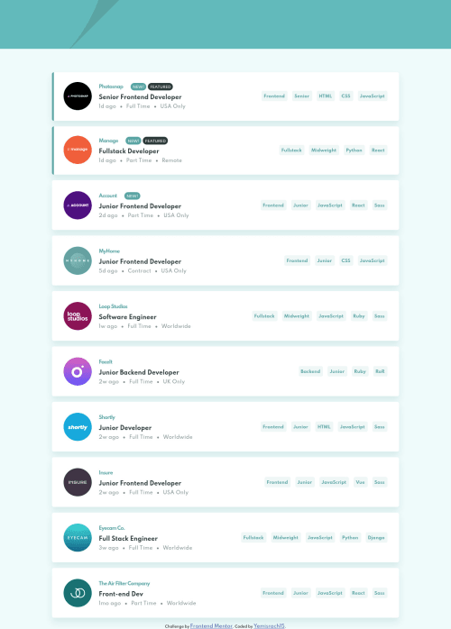
Mobile first job listing site with filtering
sass/scss

@Yemisrach15
Solution retrospective
I am pretty satisfied with the outcome . I tried organizing my sass into folders.
- How does it look?
- In what file should the style related to margin and padding go to? I had a hard time figuring this out.
Code
Please log in to post a comment
Log in with GitHubCommunity feedback
- @grace-snow
Hi this looks really nice but there are some important learning points here
- make sure the js generated markup is still semantically meaningful. The structure on this is lost
- no need for an empty header on a page
- order of imports really matters in sass. It should be variables/reset first
- it’s very unusual to organise sass files like this. There are different ways to do it and it’s hard on such a small project that isn’t a full website… Usually I’d recommend at least organising component styles into one file per component (named with the component name). This is even easier if you’re using BEM as you can start a new file for each block as a general rule
- be careful nesting scss where the element part of the class name is nested underneath the block part. There’s nothing inherently wrong with doing it that way but I can tell you from years of experience that this on larger projects makes the scss really unwieldy, hard to read and hard to debug. A good rule for this is to only nest pseudo elements, pseudo states, media queries and direct sibling selectors where necessary. You may need to repeat the block part of class names, but your css will be so much easier to read. Just an idea.
Good luck with this and the next one

Join our Discord community
Join thousands of Frontend Mentor community members taking the challenges, sharing resources, helping each other, and chatting about all things front-end!
Join our Discord