Mobile first landing page using Gatsby and styled components

Solution retrospective
Still needs some work for very wide screens (32 inch monitors, etc.).
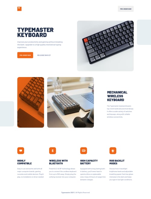
Used this nifty property for the image with phone and keyboard with the orange overlay:
mix-blend-mode: multiply;
How I did the orange overlay was that I wrapped the image inside a container and gave the container and background color of rgb(241, 103, 24). I then applied the above CSS property to the image and gave it an opacity of 0.75.
Viewing the website on a 32 inch screen is not a pretty site (no pun intended), but I'll work to patch that up eventually.
Todos:
- The Gatsby plugin for breakpoints are loading the wrong images for their devices. Tablet image is showing instead of the desktop image when viewing on a screen that is 1440px or greater. Definitely going to fix this on Monday.
- Fix accessibility and HTML issues.
As a keyboard enthusiast, I was very delighted about this challenge. As always, please feel free to give any feedback.
Please log in to post a comment
Log in with GitHubCommunity feedback
No feedback yet. Be the first to give feedback on Vinci Taylaran's solution.
Join our Discord community
Join thousands of Frontend Mentor community members taking the challenges, sharing resources, helping each other, and chatting about all things front-end!
Join our Discord