Not Found
Not Found
Not Found
Not Found
Not Found
Not Found
Not Found
Not Found
Not Found
Not Found
Not Found
Not Found
Not Found
Not Found
Not Found
Not Found
Not Found
Not Found
Not Found
Not Found

Submitted

Mobile first, Next.js

@pikapikamart

Desktop design screenshot for the Space tourism multi-page website coding challenge

This is a solution for...

  • HTML
  • CSS
  • JS
3intermediate
View challenge

Design comparison


SolutionDesign

Solution retrospective


Hello. This is my 23rd challenge here and trying to be good at framer-motion^^

It's been really fun doing this even if I finished for days since got loads of school activs :>>.I am still new to using framer-motion so I don't really know if I used it correct but it works for now and i'm glad with that. I also reuse some animations that I used before :>

I tried to add more animation like page load but I really lack what to add so I kind of erase that one but I added some animations on the different tabs interactive elements and happy with the result. I forgot to right now a navlinks trap-focus but could done in other day:>

But overall, i'm happy with this one. Would be really great if you have find any other bugs on this one. Thank you^^

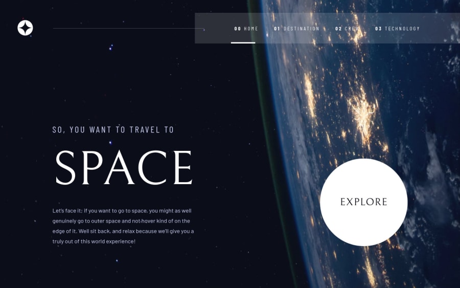
Community feedback

Sameh 430

@SamehCode

Posted

great job .bro . i hope i be professional once.

1

@pikapikamart

Posted

@SamehCode Thank you :>>

Just keep coding and eventually you will get there. Also try to always look up for different solutions here in FEM. Reviewing and checking websites really help a person^^

0
P
ApplePieGiraffe 30,545

@ApplePieGiraffe

Posted

Hey, Raymart Pamplona! 👋

It's nice to see you complete another challenge! 😀 Fantastic work on this one! 🙌

I actually noticed that you had posted a new solution about a week or two ago, but didn't manage to check it out in full until now. 😅

I love the animations that you added to your solution (such as the slide in/out of the text and the gradual fade in/out of the planets). They are very smooth and match the look and feel of the design well. 👍

The only thing I'm not sure about is how to navigate the site in the mobile layout of the page (since the header navigation disappears at that point and there are no other visual cues as how to navigate between pages , then). 😉🤷

Otherwise—everything else looks pretty spot on! 😀

Keep coding (and happy coding, too)! 😁

1

@pikapikamart

Posted

@ApplePieGiraffe Thanks APG and glad that you liked the site :>>

For the mobile navigation, don't really know about this one. Is the hamburger not showing for you? If it is, when toggling it, on the navlinks, there is this white line on its right side showing where you are, is it not visible on your end? I tried removing the dropdown as well after selecting a link so that I could shift the focus on the body of the next page as well^^

1
P
ApplePieGiraffe 30,545

@ApplePieGiraffe

Posted

@pikapikamart

Hey, sorry for my very late reply! 😅

I didn't see the hamburger menu button before. I could have sworn it wasn't there—either that, or I'm going blind! 😂

Regardless—it's showing up, now, in the mobile layout, so you're good to go! 👍

Take care! 🙂

1

@pikapikamart

Posted

@ApplePieGiraffe Oh hahaha now that's really weird. Maybe it just didn't load at first or maybe you need some rest at that time :>

Thanks again APG, a relief since it is not a bug:>>

1

@zineb-Bou

Posted

Hi there, It's a good solution I noticed something: Image at the technology page on desktop layout, it gets stretched to fit the width I recommend the use object-fit :cover , to preserve the image quality.

1

@pikapikamart

Posted

@zineb-Bou Hey, glad that you liked it^^

I didn't use the object-fit since by doing it, it won't look like the same with the design since it just stretches it out^^

0
Dooney 180

@dooneyy

Posted

This is really good. great job! Everything looks good, the animations particularly. Can you tell me more about how you made that happen? Once again welldone!

0
Harsh 210

@HarshPrateek559

Posted

Amazing design!!! I was just blown away by all the animations which you have used on your website. I am also trying to do the same, but till now I am no way near as good in terms of animations as you are. Can you tell me how can I improve upon that? It looks so good in the design.

Also, I saw that your explore button is not redirecting to the destination page. According to the design, you should make use of the button to redirect to the destination page.

0

Please log in to post a comment

Log in with GitHub
Discord logo

Join our Discord community

Join thousands of Frontend Mentor community members taking the challenges, sharing resources, helping each other, and chatting about all things front-end!

Join our Discord