Skip to content
  • Unlock Pro
  • Log in with GitHub
Solution
Submitted about 4 years ago

Mobile first, pure CSS

Mallory•120
@azerroth11
A solution to the 3-column preview card component challenge
View live sitePreview (opens in new tab)View codeCode (opens in new tab)

Solution retrospective


How do I make it so that I don't need to use !important in my computer version when creating mobile first ?

I did mobile first. So my stylesheet links look like this:

<link rel="stylesheet" media="screen and (min-width: 768px)" href="./css/style.css"> <link rel="stylesheet" href="./css/mobile.css">
Code
Couldn’t fetch repository

Please log in to post a comment

Log in with GitHub

Community feedback

  • Cian•80
    @ciandm
    Posted about 4 years ago

    Hi Mallory,

    I see you've used two stylesheets (
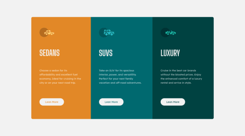
mobile.css & style.css) , when in fact you only need to use one here. You should move all of your styles from mobile.css into your style.css and place it towards the top. As the name suggests, the C in CSS means cascading, which means styles towards the bottom of the file will overwrite those at the top if they have the same class name or CSS selector. Therefore, if you place your mobile styles towards the top, these will be read first. Then, to style it for desktop you should place all of your desktop files in a media query underneath your mobile styles. Something like this:

    @import url('https://fonts.googleapis.com/css2?family=Big+Shoulders+Display:wght@700&family=Lexend+Deca&display=swap');
    
    * {
      margin: 0;
      padding: 0;
    }
    
    :root {
      --sedans-color: hsl(31, 77%, 52%);
      --suvs-color: hsl(184, 100%, 22%);
      --luxury-color: hsl(179, 100%, 13%);
      --paragraphs-color: hsla(0, 0%, 100%, 0.75);
      --lightgray-color: hsl(0, 0%, 95%);
    }
    
    ...
    
    .cards {
      display: flex;
      flex-direction: column;
      padding: 4rem 1.5rem;
    }
    
    // rest of your mobile styles
    ...
    
    @media screen and (min-width: 768px) {
    
     // desktop styles go in here, and these will overwrite your styles above due to the 
         cascading nature of CSS
    
     .cards {
       flex-direction: row;
       margin: 0 10rem; 
     }
    }
    

    You will now no longer need to use !important to overwrite the styles and your import in your HTML can simply become:

    <link rel="stylesheet" href="./css/style.css">
    

    Hope that helps you.

  • Mallory•120
    @azerroth11
    Posted about 4 years ago

    Thank you so much for your precise answer, it indeed fixed my issue and I'll make sure to do so in the future on my small projects ! It was a great help, have a lovely coding day !

Join our Discord community

Join thousands of Frontend Mentor community members taking the challenges, sharing resources, helping each other, and chatting about all things front-end!

Join our Discord

Stay up to datewith new challenges, featured solutions, selected articles, and our latest news

Frontend Mentor

  • Unlock Pro
  • Contact us
  • FAQs
  • Become a partner

Explore

  • Learning paths
  • Challenges
  • Solutions
  • Articles

Community

  • Discord
  • Guidelines

For companies

  • Hire developers
  • Train developers
© Frontend Mentor 2019 - 2025
  • Terms
  • Cookie Policy
  • Privacy Policy
  • License

Oops! 😬

You need to be logged in before you can do that.

Log in with GitHub

Oops! 😬

You need to be logged in before you can do that.

Log in with GitHub

How does the accessibility report work?

When a solution is submitted, we use axe-core to run an automated audit of your code.

This picks out common accessibility issues like not using semantic HTML and not having proper heading hierarchies, among others.

This automated audit is fairly surface level, so we encourage to you review the project and code in more detail with accessibility best practices in mind.

How does the CSS report work?

When a solution is submitted, we use stylelint to run an automated check on the CSS code.

We've added some of our own linting rules based on recommended best practices. These rules are prefixed with frontend-mentor/ which you'll see at the top of each issue in the report.

The report will audit all CSS, SCSS and Less files in your repository.

How does the HTML validation report work?

When a solution is submitted, we use html-validate to run an automated check on the HTML code.

The report picks out common HTML issues such as not using headings within section elements and incorrect nesting of elements, among others.

Note that the report can pick up “invalid” attributes, which some frameworks automatically add to the HTML. These attributes are crucial for how the frameworks function, although they’re technically not valid HTML. As such, some projects can show up with many HTML validation errors, which are benign and are a necessary part of the framework.

How does the JavaScript validation report work?

When a solution is submitted, we use eslint to run an automated check on the JavaScript code.

The report picks out common JavaScript issues such as not using semicolons and using var instead of let or const, among others.

The report will audit all JS and JSX files in your repository. We currently do not support Typescript or other frontend frameworks.

Oops! 😬

You need to be logged in before you can do that.

Log in with GitHub

Oops! 😬

You need to be logged in before you can do that.

Log in with GitHub