


@eleswastaken
Posted
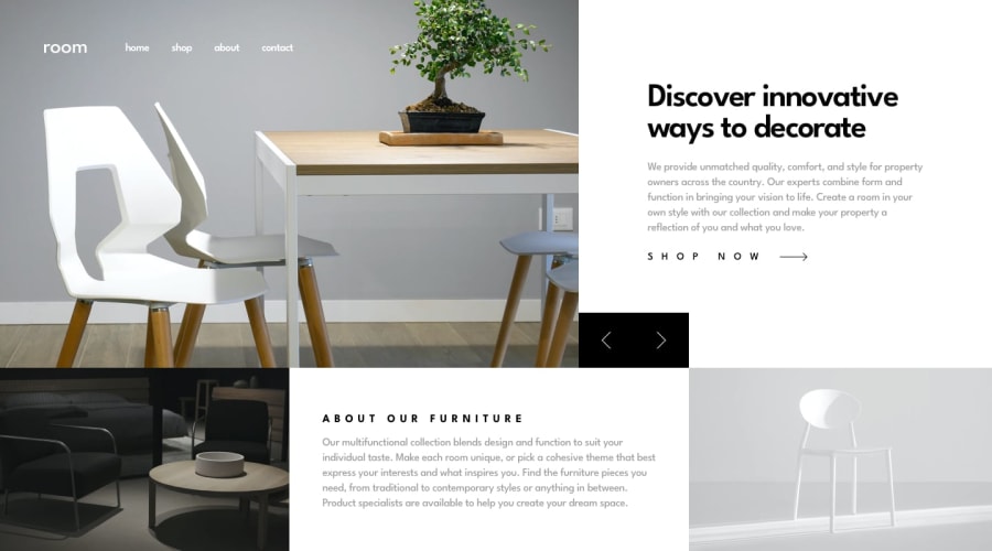
Whenever you see container that stretches only one row, you'd probably better using flexbox instead of a grid. It seems that you build the about section using grid, but in this particular example flexbox would shine brightest. You could use something like:
// for the images around the content
flex: 30%; // this would set flex-grow and shrink to 1, and the width of a flex item width to 30%

// for the content itself
flex: 40%; // this would set flex-grow and shrink to 1, and the width of a flex item width to 40%
You would end up with a symmetrically looking line of content.
Also if you used flexbox for the slider container as well and set the image width to something like 65%, and the text content to 30%, you could use that 5% for buttons and that would almost match the design. A little math and everything looks nice!
Accessibility: Here the buttons should be, well, buttons and not spans. You need make sure that you page is interactive, and accessible to everyone. Use <button> element.
Good luck!
Marked as helpful
