Mobile First - Responsive - CSS Grid - SCSS

Solution retrospective
Hello! Any advice or comments would be appreciated, thank you!
Please log in to post a comment
Log in with GitHubCommunity feedback
- @AlexKMarshall
This looks great, and it's nice and responsive at various screen-sizes.
For the markup there's just a few things that might be worth looking at.
The top level
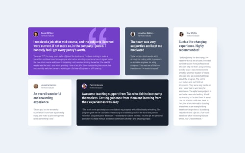
<article>is probably unnecessary, you could move its styles onto<main>. Each individual testimonial should have a header for easier navigation through the page. The highlighted text would work well as that and could be<h2>elements instead of<p>. I see you have a hidden<h1>so that preserves the heading hierarchy. If this was a real page, and not just a subset of the page, then that<h1>would be visible on the page somewhere so that's fine I think. The alt texts for the images should not include the word "picture" or other similar words like "image" as a screen-reader will read out that the element is an image, so it is redundant.The body font-size seems really small on my screen, and I'm guessing that was specified in the design. But I would be very careful with font-sizes anything less than
1rem=16pxas they can be very hard to read. The colors of some of the text against the background are too low in contrast as well. You can use Lighthouse to check these and then adjust the lightness of either the background or the font color to compensate. If you create CSS Custom Properties for your colors then that will make it easier to change them in one placeIn general this looks great though.
Marked as helpful

Join our Discord community
Join thousands of Frontend Mentor community members taking the challenges, sharing resources, helping each other, and chatting about all things front-end!
Join our Discord