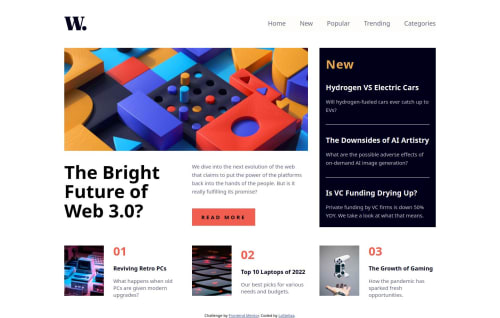
Mobile first responsive design

Solution retrospective
I am happy with the result overall, especially the responsiveness achieved with CSS Grid. I used the grid template areas and it worked great. I am understanding more and more the importance of a well structured HTML and i want to keep focusing on that.
What challenges did you encounter, and how did you overcome them?Since it was my first time using grid areas, it took me a little bit of time to get it to work like i wanted to, especially the image. Another challenge was the menu on mobile screen, since i had to style it i could not use the display: none and had to rely on opacity 0 , which made my JS a bit more complicated that it could have been.
What specific areas of your project would you like help with?If anyone has suggestions on how i can simplify my code, i am all ears!!
Please log in to post a comment
Log in with GitHubCommunity feedback
- @SortJakke
Hello, here is some feedback on your project:
Issues found:
- On the page, each clickable article has a hover effect, but ideally, these elements should be links that allow users to access the full article. Making them keyboard-accessible is essential to ensure inclusive navigation.
- The menu button is also not accessible via the keyboard, which affects the experience for users relying on this functionality.
Suggestions for improvement:
- You can simplify the HTML by adding the "grif-container" class directly to the <main> tag. Using two tags to contain the same content is redundant and can be avoided.
- I recommend using a button (<button>) instead of an image (<img>) to open the menu, as it is semantically more appropriate and improves the page’s accessibility. Additionally, you could create two classes: one for the closed state and another for the open state. In JavaScript, you would simply toggle the classes, making the menu open script much simpler and more efficient.
- In the main article, I suggest creating a single <section> and dividing it into <div>s. This structure would be more correct, as the current code makes the elements seem unrelated. Additionally, the appropriate tag for containing images is <figure>.
- For the footers, it might be a good idea to group all elements into a single <section>, although I understand the reasoning for keeping them separate.
Final thoughts: Despite these suggestions, your solution is visually very similar to the provided design. Congratulations on the great work!
Marked as helpful

Join our Discord community
Join thousands of Frontend Mentor community members taking the challenges, sharing resources, helping each other, and chatting about all things front-end!
Join our Discord