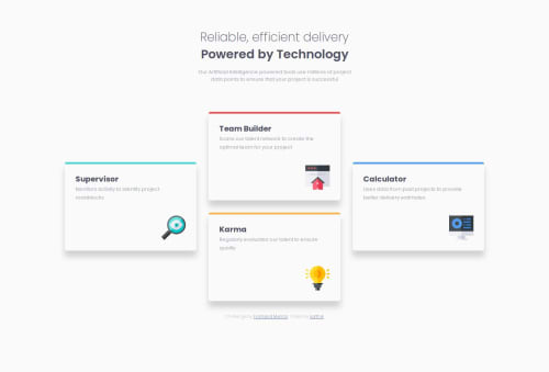
Submitted over 1 year agoA solution to the Four card feature section challenge
Mobile First Responsive Four Card Design Using BEM
bem

@karthickg24
Solution retrospective
What are you most proud of, and what would you do differently next time?
I continued to use BEM methodology and Mobile First in this project. I tried to use SASS in my next project and along with BEM and Mobile First approach.
I m exploring on Grid System.
What challenges did you encounter, and how did you overcome them?I have trouble in placing the cards in correct position. I figured out way using grid-template-areas. we can always use other methods like grid-column and grid-row in child items to achieve that.
What specific areas of your project would you like help with?NA
Code
Loading...
Please log in to post a comment
Log in with GitHubCommunity feedback
No feedback yet. Be the first to give feedback on karthickg24's solution.
Join our Discord community
Join thousands of Frontend Mentor community members taking the challenges, sharing resources, helping each other, and chatting about all things front-end!
Join our Discord