


@correlucas
Posted
👾Hello my friend Johnny, congratulations for your new solution!
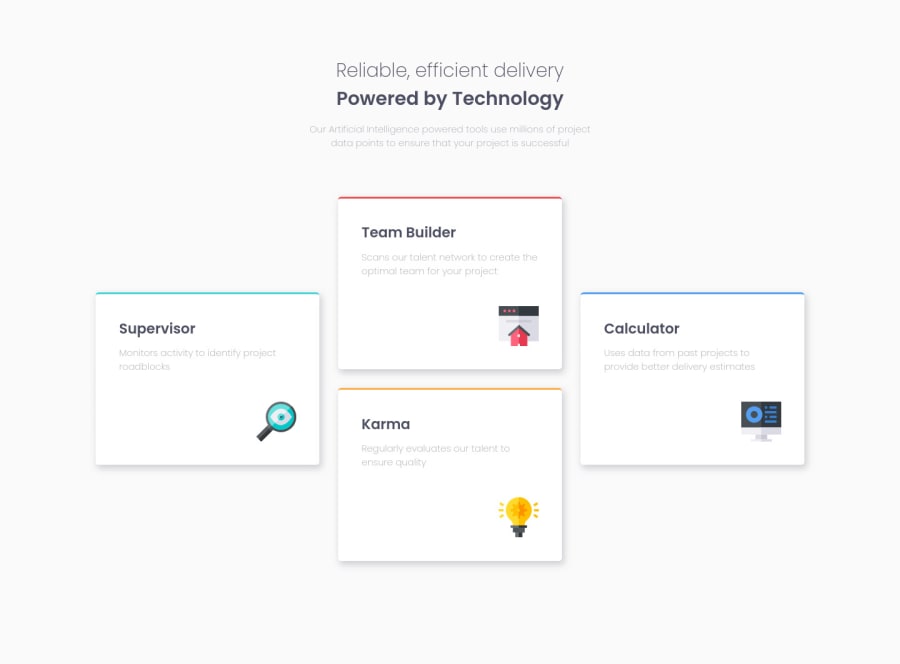
Your solution is just great, you did a really good work with GRID. I did this challenge too and I was not patient so I've used FLEX to create this grid but my code was really more long that yours. Great work here.
The only thing you can improve here is give less padding to the body, because doing that you give less space for your cards grow when the screen scales down, a margins of 24px for the container is enought.
You don't really need to set the grid-rows-template here, see the code fixes below":
body {
    /* padding: 4em; */
}

@media (min-width: 768px)
article {
        /* grid-template-rows: 1fr 1fr 1fr 1fr; */
}
👋 I hope this helps you and happy coding!
Marked as helpful
@johnnysedh3lllo
Posted
Thanks Lucas, i will implement the changes. i believe i don't need the grid-template-rows because the rows will form automatically because i specified the grid area on the elements. right?
@correlucas
Posted
@johnnysedh3lllo If you use grid-area you need to specify, but if you use grid-template-column by default they repeat the rows as the columns, I'm saying that because I ever use columns and never set the rows unless you've a complex grid, in this case yes.
Marked as helpful
@johnnysedh3lllo
Posted
alright man. thanks for the explaination. will take out the grid-template-rows
