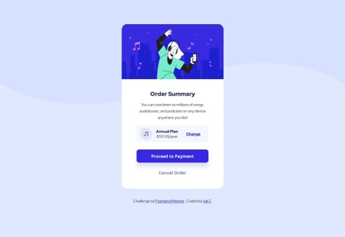
Mobile-First Responsive Order Summary Component

Solution retrospective
Using a mobile-first approach, I first re-create the provided mobile design template as accurately as possible with CSS and HTML. This process takes the most time as I make several passes to ensure the result is both accurate to the design's wireframe and also utilizing DRY code. From there, I added the challenge's requested media queries to allow for desktop viewing by modifying background image pathways and sizing.
What challenges did you encounter, and how did you overcome them?A big struggle for me on this project was that it was my first time utilizing CSS Grid in a practical application. While I was familiar with the usual Flexbox horizontal and vertical alignment rules of 'justify-content/self' and 'align-content/self', Grid utilizes 'justify-items' and 'align-items'. That was something new I didn't know before, and I was excited to learn it to help solve this challenge!
What specific areas of your project would you like help with?I would love some feedback on cleaning up the HTML/CSS and writing DRYer code.
Please log in to post a comment
Log in with GitHubCommunity feedback
No feedback yet. Be the first to give feedback on valryanb's solution.
Join our Discord community
Join thousands of Frontend Mentor community members taking the challenges, sharing resources, helping each other, and chatting about all things front-end!
Join our Discord