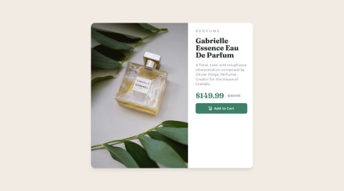
Submitted about 1 year agoA solution to the Product preview card component challenge
Mobile first responsive solution using Tailwind CSS
tailwind-css, vite

@abhixdev
Solution retrospective
What are you most proud of, and what would you do differently next time?
I'm mostly proud that I prioritized designing for small screen sizes first (mobile screens). Next time, I would make sure to prioritize making it friendly for medium screen sizes before moving on to large screen sizes.
What challenges did you encounter, and how did you overcome them?Making it responsive for web and medium-sized screens
What specific areas of your project would you like help with?Responsiveness and accessibility.
Code
Loading...
Please log in to post a comment
Log in with GitHubCommunity feedback
No feedback yet. Be the first to give feedback on Abhishek Kumar's solution.
Join our Discord community
Join thousands of Frontend Mentor community members taking the challenges, sharing resources, helping each other, and chatting about all things front-end!
Join our Discord