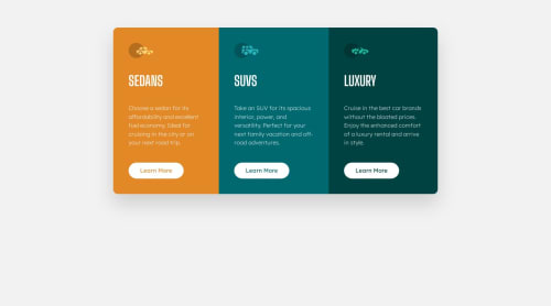
Submitted about 1 year agoA solution to the 3-column preview card component challenge
Mobile first responsive solution using Tailwind CSS
tailwind-css, vite

@abhixdev
Solution retrospective
What are you most proud of, and what would you do differently next time?
I was able to complete the challenge.
What challenges did you encounter, and how did you overcome them?Making components spacing according to the screen sizes.
Code
Please log in to post a comment
Log in with GitHubCommunity feedback
- @AkoToSiJeromeEh
Hey ! great work out there i just notice that you using margin to center horizontally the 3 column card component but it doesn't work as i notice , i suggest that you can use display : grid or display : flex with a min-height or height for proper alignment . by adding those css property you properly align the card horizontally . thats all happy coding !
** the my-12 is apply on section **
.my-12 {
  margin-top: 3rem; // remove this
  margin-bottom: 3rem; // remove this
}
body { margin: 0; line-height: inherit; display: grid; // add this place-items: center; // add this min-height: 100dvh; // add this }Marked as helpful

Join our Discord community
Join thousands of Frontend Mentor community members taking the challenges, sharing resources, helping each other, and chatting about all things front-end!
Join our Discord