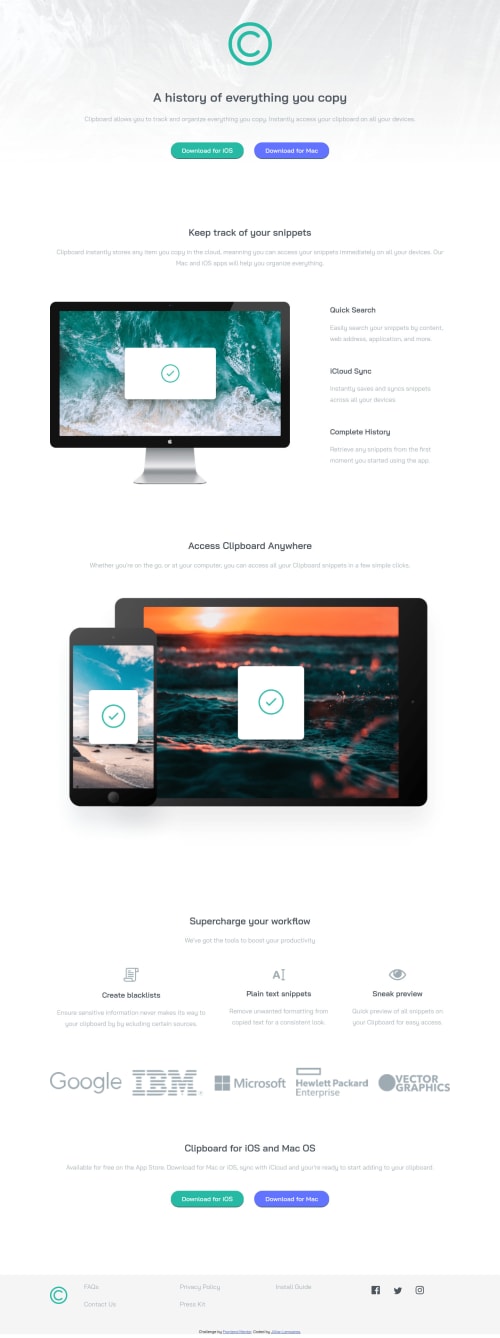
Mobile First Responsive Web Page using CSS Flex Box

Solution retrospective
Questions I have:
-
How to make my buttons responsive? I ended up just making a media query at small screen sizes that allowed the buttons to not "break" at smaller screens. The buttons looked great until about 350 px and smaller. I could not find a great way to make the button proportionally shrink with the screen. In the media query, I ended up changing my padding and font size which ended up working great...but is this good practice?
-
Any good tips on making spaces between sections of code? I got the web page to look how I needed it, but I ended up using so many margins and padding that I am sure there is a better way to do this. If you take a look at my code, you will see lots of "margin-bottom" and properties like this, and I want to know if there is a better and cleaner way to get spacing right.
Please log in to post a comment
Log in with GitHubCommunity feedback
No feedback yet. Be the first to give feedback on Jillian Lemsanes's solution.
Join our Discord community
Join thousands of Frontend Mentor community members taking the challenges, sharing resources, helping each other, and chatting about all things front-end!
Join our Discord