


@correlucas
Posted
👾Hello Elaine, congratulations for your solution!
I was checking this old solution! To see if I find something to improve, but its hard, all of your old solutions are just fine!
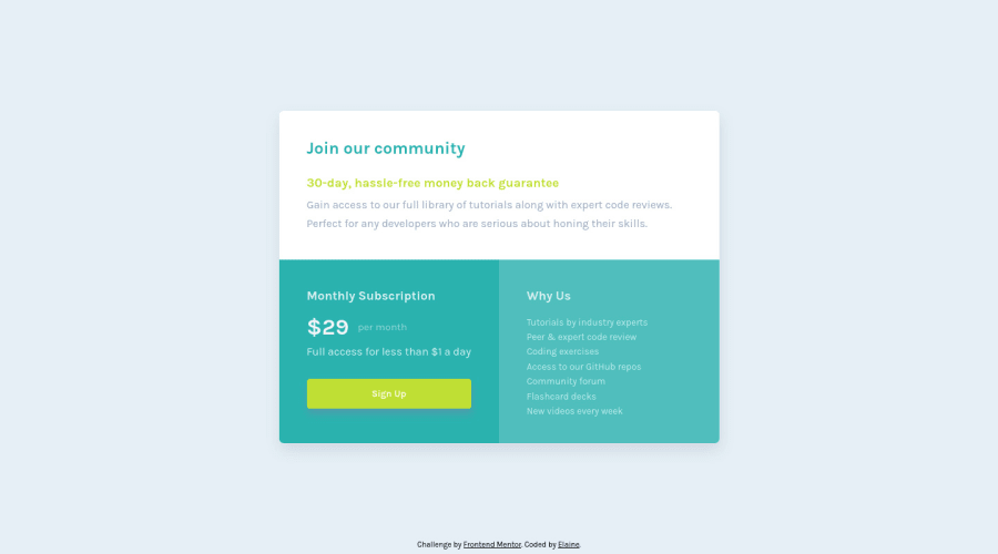
🕵️Then I was thinking that for the mobile version, to avoid the big lateral gap, you can let the container grow and resize with the screen, but to do that I had to make off a lots of property to see what was avoiding the container to grow full width minus the margin/padding.
Then I realized that the only line of code that was avoiding the container to fit the screen and scale normally was a single width. See the code below:
.component {
    justify-content: center;
    height: min-content;
    border-radius: 0.4em;
    box-shadow: 1px 10px 20px hsl(212deg 23% 85%);
    /* width: 318px; */
}
Anyway, great solution as always here, this minimum detail isn't even important!
Marked as helpful
@elaineleung
Posted
@correlucas Thank you Lucas! Yes, this was one of the earlier ones I did where I only made the 375px and 1440px screen sizes optimal. Good that you helped me locate the lines already and save me the work when I do my updates 😊
