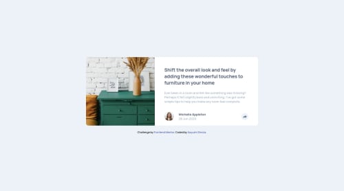
Mobile first site using HTML CSS and JS

Solution retrospective
Hello everyone!
This was so much fun challenge! I used gird place-item: center short-hand property for centralize everything.
While making this challenge I was getting confused by giving width to article element. What I've done here is initially I assigned width: 320px for article element and for media query I changed it to width: 720px. Is it is good practice or there are some other way to do this.
Feedback is appreciated!
Happy Coding:)
Please log in to post a comment
Log in with GitHubCommunity feedback
- @grace-snow
Hi,
This looks really nice. I find the source of the animation a bit strange on the desktop version, but that's just preference I think. I'd rather see it increase in height or something so it moves in from the button position, whereas atm it seems to rise up from a position below the button...
In answer to your question though, I think all you need is max-width for the card. That's fine to be in pixels or rems.
And you can adjust it in media queries, but you may find you don't even need to.
A the best
- @Zana994
Hello, it is always better to use width in percentages for responsive design.


Join our Discord community
Join thousands of Frontend Mentor community members taking the challenges, sharing resources, helping each other, and chatting about all things front-end!
Join our Discord