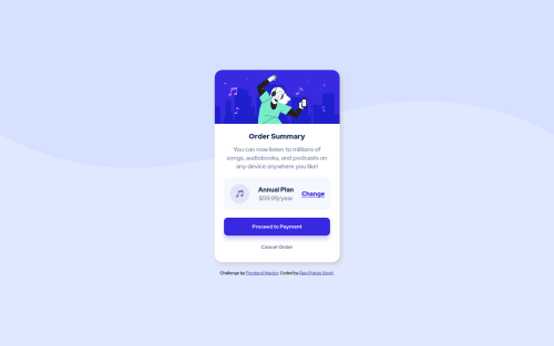
Not Found
Not Found
Not Found
Not Found
Not Found
Not Found
Not Found
Not Found
Not Found
Not Found
Not Found
Not Found
Not Found
Not Found
Not Found
Not Found
Not Found
Not Found
Not Found
Not Found

Submitted

Mobile first site using html, css-flexbox.

@cyberspatial

Desktop design screenshot for the Order summary component coding challenge

This is a solution for...

  • HTML
  • CSS
1newbie
View challenge

Design comparison


SolutionDesign

Solution retrospective


Your constructive criticism will help me to improve my skills.

Community feedback

@MojtabaMosavi

Posted

1- using relative units such as rem and em make you styles behave more as expected across different divices because they are based on the defualt fontize and they change accordingly. Personaly I use em for media queries and rem for paddings and margins.

2- Try to use descriptive names for you markup, for instance para could be substitued with description. I suggest you spend some time reading about BEM because it makes it easier for you to name stuff amoungst many other benefits.

Keep coding :=)

Marked as helpful

2
P
Patrick 14,325

@palgramming

Posted

you should change the background-size on your body tag from 100% to 100vw 40vh

Marked as helpful

1
Ahmed Faisal 5,095

@afrussel

Posted

  • Using a max-width: 450px; for .card class
  • Change image fix height as well
1

Please log in to post a comment

Log in with GitHub
Discord logo

Join our Discord community

Join thousands of Frontend Mentor community members taking the challenges, sharing resources, helping each other, and chatting about all things front-end!

Join our Discord