Not Found
Not Found
Not Found
Not Found
Not Found
Not Found
Not Found
Not Found
Not Found
Not Found
Not Found
Not Found
Not Found
Not Found
Not Found
Not Found
Not Found
Not Found
Not Found
Not Found

Submitted

Mobile first site using Sass, Gulp and Flexbox

@jnnrdn

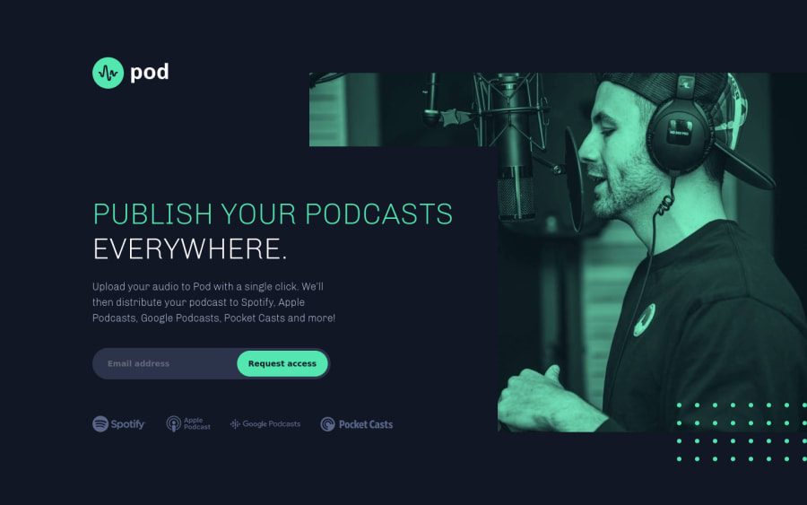
Desktop design screenshot for the Pod request access landing page coding challenge

This is a solution for...

  • HTML
  • CSS
  • JS
1newbie
View challenge

Design comparison


SolutionDesign

Solution retrospective


Constructive feedback is always appreciated! :)

Community feedback

@Nocks

Posted

Hey Jenny! Great work there.

I love your work! By the way, I'm using a small laptop, and your work doesn't display the way you intended for desktop.

Hence, you may want to use this online tool at the link below to check the responsiveness of your work.

https://responsivedesignchecker.com

I hope it helps.

1

@jnnrdn

Posted

Hi Nocks! Thank you, and thanks for your feedback!

I'll look into the responsiveness and try out the tool you recommended. Do you prefer it to using the dev tools in FireFox or Chrome?

0

@Nocks

Posted

Well, I use either dev tools (Chrome especially) while developing to also check for responsiveness. However, for me personally, the experience can be boring sometimes (manual and limited screen size in some cases).

Hence, I use both https://responsivedesignchecker.com and http://www.responsinator.com to double-check, after I've pushed my code to "live". Really fast and they give a better picture of things.

0

Please log in to post a comment

Log in with GitHub
Discord logo

Join our Discord community

Join thousands of Frontend Mentor community members taking the challenges, sharing resources, helping each other, and chatting about all things front-end!

Join our Discord