Not Found
Not Found
Not Found
Not Found
Not Found
Not Found
Not Found
Not Found
Not Found
Not Found
Not Found
Not Found
Not Found
Not Found
Not Found
Not Found
Not Found
Not Found
Not Found
Not Found

Submitted

Mobile first social media dashboard with vanilla Js

@vivienbalint

Desktop design screenshot for the Social media dashboard with theme switcher coding challenge

This is a solution for...

  • HTML
  • CSS
  • JS
2junior
View challenge

Design comparison


SolutionDesign

Solution retrospective


Thoughts? :)

Community feedback

P
ApplePieGiraffe 30,565

@ApplePieGiraffe

Posted

Hey, Vivien Bálint! 👋

Nice to see you complete another challenge! 👍 Good work on this one! 👏

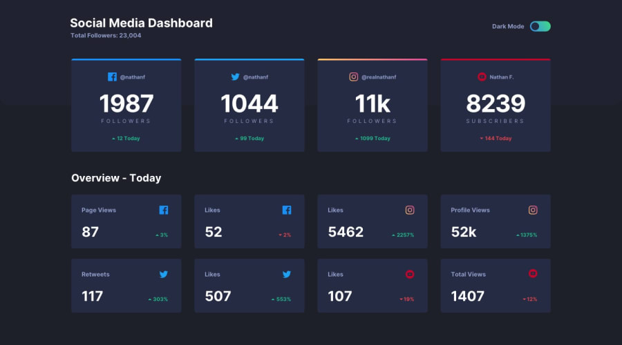
Your solution looks good, is responsive, and the light/dark themes work well! 🙌

I suggest,

  • Making the toggle-switch tabbable so that it is accessible to keyboard users.
  • Adding a max-width to the main container or wrapper to prevent the layout from becoming too wide on extra-large screens.
  • Decreasing the margin to the sides of the grid so that there's more room for the grid as the screen width decreases.

Keep coding (and happy coding, too)! 😁

1

@vivienbalint

Posted

Thank you! :)

0
Web Frog 1,840

@MasterDev333

Posted

Great work @vivientbalint. It's fully responsive and very close to design. In my humble opinion, it would be great if you use Grid rather than Flex box. As you know, in grid, you can set column gaps and row gaps. It would be better if you use those css properties rather than set margin for flex box items, I think. And add transitions to the card will make the hover effect smoothly. Hope it helps. Happy coding~ :D

1

@vivienbalint

Posted

Thank you! :)

0

Please log in to post a comment

Log in with GitHub
Discord logo

Join our Discord community

Join thousands of Frontend Mentor community members taking the challenges, sharing resources, helping each other, and chatting about all things front-end!

Join our Discord