Mobile-first solution using CSS Flexbox

Please log in to post a comment
Log in with GitHubCommunity feedback
- P@Islandstone89
HTML:
-
Every webpage needs a
<main>that wraps all of the content, except for<header>andfooter>. This is vital for accessibility, as it helps screen readers identify a page's "main" section. Wrap the card in a<main>. -
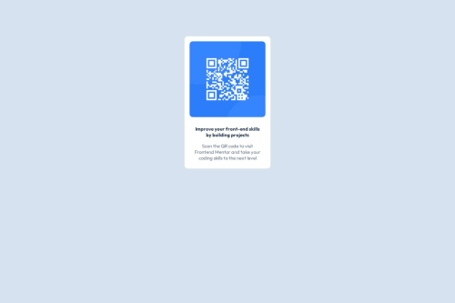
The alt text must also say where it leads(the frontendmentor website). A good alt text would be "QR code leading to the Frontend Mentor website."
-
"Improve your" is a heading. I would make it a
<h2>- a page should only have one<h1>, reserved for the main heading. As this is a card heading, it would likely not be the main heading on a page with several components.
CSS:
-
It is best practice to write CSS in a separate file, often called
style.css. Create one in the same folder as theindex.html, and link to it in the<head>:<link rel="stylesheet" href="style.css">. -
Including a CSS Reset at the top is good practice.
-
Remember to specify a fallback font:
font-family: 'Outfit',sans-serif; -
Remove the
marginonbody. -
I would recommend adding
1remofpaddingon thebody, to ensure the card doesn't touch the edges on small screens. -
Remove the margin on the card.
-
To center the card horizontally and vertically, I would use Flexbox on the body:
display: flex; flex-direction: column; justify-content: center; align-items: center; min-height: 100svh;-
Remove the width on the image.
-
Remove the
widthon the card - it's rarely a good idea to set fixed sizes, as we need our components to shrink and grow in response to all kinds of different devices. -
We do want to limit the width of the card, so it doesn't get too wide on larger screens. Give the card a
max-widthof around20remto solve this issue. -
font-sizemust never be in px. This is a big accessibility issue, as it prevents the font size from scaling with the user's default setting in the browser. Use rem instead. -
Paragraphs have a default value of
font-weight: 400, so there is no need to declare it. -
Since all of the text should be centered, you only need to set
text-align: centeron the body, and remove it elsewhere. The children will inherit the value. -
On the image, add
display: blockandmax-width: 100%- the max-width prevents it from overflowing its container. Without this, an image would overflow if its intrinsic size is wider than the container.max-width: 100%makes the image shrink to fit inside its container. Remove themargin, though you could give it amargin-bottom. -
To create the space between the image and the edge of the card, set
paddingon all 4 sides of the card:padding: 1rem;.
Marked as helpful -
- @guilhermesiqueira13
I learned a lot from this challenge, it made me think a lot about things that escape us when we are learning.
Marked as helpful


Join our Discord community
Join thousands of Frontend Mentor community members taking the challenges, sharing resources, helping each other, and chatting about all things front-end!
Join our Discord