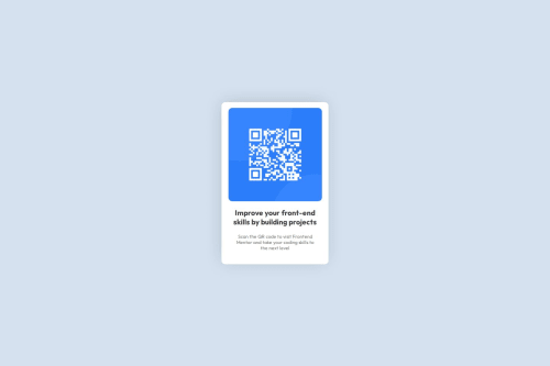
Submitted 2 months agoA solution to the QR code component challenge
Mobile-first solution using Flexbox

@MandalTuhin
Solution retrospective
What are you most proud of, and what would you do differently next time?
I am proud of implementing this solution from scratch. I am proud of using css flexbox properly (as I am a beginner). I think I made the site as close as possible to the reference image provide. The site is mobile first. which means that it is made keeping in mind mobile users.
What challenges did you encounter, and how did you overcome them?Challenges I encountered:
- I didn't know how to implement box shadow in CSS. so I looked at box-shadow generator on the internet to seek help for the drop shadow the centered div has.
- I didn't know how to identify the fonts. but I realized that style-guide.md contains these. which saved a lot of my time trying to guess the fonts.
I want to learn about box-shadow property in css and how to implement it. Thank you.
Code
Loading...
Please log in to post a comment
Log in with GitHubCommunity feedback
No feedback yet. Be the first to give feedback on Tuhin Mandal's solution.
Join our Discord community
Join thousands of Frontend Mentor community members taking the challenges, sharing resources, helping each other, and chatting about all things front-end!
Join our Discord