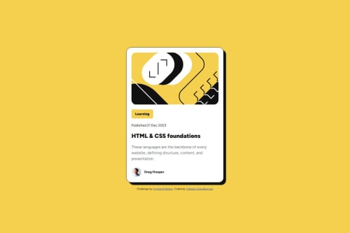
Mobile-first solution using pure HTML & CSS Blog Preview Card

Solution retrospective
When i making website i always start with desktop version. making desktop version first usually make the mobile design harder as content need to be placed appropriately follow mobile screen size. Then i start to create mobile design first and realize that resizing from mobile to desktop is easier because content on mobile can be resized, customized into desktop version.
What challenges did you encounter, and how did you overcome them?To achieve profile image design. i use transform: scale(0.6) to make it smaller. then the margin of the picture start to break. to solve it, i use margin-left: -1.2rem so it align neatly as other element.
are there better way to resize the image without changing the image margin?
Please log in to post a comment
Log in with GitHubCommunity feedback
- @Ankush9800
Thank you
- @Ankush9800
can you say how to import custom font

Join our Discord community
Join thousands of Frontend Mentor community members taking the challenges, sharing resources, helping each other, and chatting about all things front-end!
Join our Discord