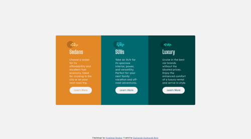
Submitted about 4 years agoA solution to the 3-column preview card component challenge
Mobile First using CSS and HTML

@zach7815
Solution retrospective
Hi I feel like I am getting better at flexbox and styling things with this project. This time I programmed the styling for mobile screens first and then used media queries to adapt the layout for desktop screens.
Is this a common or accepted approach to take? I found I had to use a lot less media queries to adapt the layout for other settings.
Code
Please log in to post a comment
Log in with GitHubCommunity feedback
No feedback yet. Be the first to give feedback on Zachariah Kozlowski-Best's solution.
Join our Discord community
Join thousands of Frontend Mentor community members taking the challenges, sharing resources, helping each other, and chatting about all things front-end!
Join our Discord